Regardless of the company’s niche, a strong internet presence is one of the most important priorities. If you want a successful website and to attract site visitors, that will use all its available features including online shopping, then you have to build a user-friendly website. Be aware of the fact the opposite situation may damage your business. In case you’re still not familiar with the term user-friendly website, and its significance, keep reading this blog post to learn about this concept.
What is a user-friendly website?
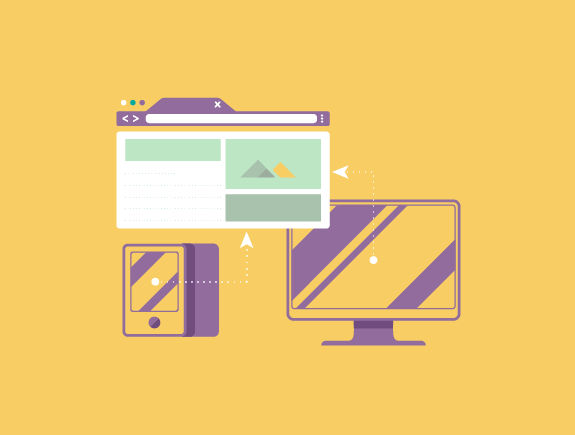
Creating a user-friendly site assumes creating a site tailored according to visitors’ needs, so they can get the info they’re searching for in a fast turnaround time on any device (laptop, tablet, mobile). Understanding the online behavior of each consumer provides an insight to web designers on what works well, and on the other hand, what should be avoided.
Some of the tips for building a valuable site are using intuitive navigation, strategically created content, and correct positioning of visuals. Also, it is essential to properly write and format the titles, so they catch the visitors’ attention and provide searched info. The following factors are also crucial:
- Responsive web design – up to 70% of traffic comes from mobile devices so it’s significant to optimize the site for smartphones,
- Well-planned content – sorting traffic into certain logical wholes is a very important step in planning, so the visitors can easily find the info they need,
- Speed – slow website speed is probably the most common cause visitors leave the site fast. ideally, the speed should be 4 – 6 seconds, because it is important not only because of the visitors but for ranking on search engines.
User-friendly site will increase the website traffic
Based on our experience, two-thirds of consumers don’t have a positive attitude about websites and mobile apps that are not user-friendly or take a lot of time to load and start.
The more you work on improving website performances, and making it accessible to consumers, the higher will be an increase of site visitors, the ones that visit your website to get desired info or buy products. If they figure out the site has been designed with a goal to make it user-friendly for its visitors and customers, they will remember those benefits and get back to the website, so they can buy any of the products again or get any info.
Sometimes, if the website doesn’t meet customers’ expectations, this situation can trigger negative emotions. Some of the negative emotions caused by bad website performances are – annoyance, frustration, anger, distrust, disrespect.
When these emotions happen, customers often turn to competitors’ websites to find the products they need. Some of them never come back or lose trust in the website and brand as well. To prevent this from happening, it is important to tailor the website according to its users and their needs.
Solutions to problems that could help your customers
Successful businesses and their websites are always customer-oriented, and that’s exactly one of the reasons for their success. If you manage to solve at least part of your customers’ problems via content, they will surely know how to reward your effort. Each website user experience should clearly lead to the solution of a certain problem in the most efficient way and fully adjust to customers’ needs.
There are many examples of websites that weren’t ranked well on the internet, but the final success they achieved was a result of being the best in what they do. Let’s take Google as an example; at first, Google wasn’t the first search engine on the market but over time, it became the best and irreplaceable. User-friendly, it won the internet users and became their online encyclopedia.
Mistakes to avoid in the process of creating a user-friendly website
If your website already has any of the following mistakes, maybe it can be a clear indicator of the insufficient sales result on your website. Also, some of these mistakes clearly show you’ve been sending a wrong message to your target audience, therefore you need an urgent change.
Hidden information
Transparency is very important if you’re selling products online, as it sends an explicit message there’s nothing you want to hide and that you are open to communication. For example, if you are hiding product prices, your customers may think you’ve been doing it on purpose, or trying to hide something so they will lose trust. If you’re hiding contact information, each customer will experience it as an unprofessional act. Most customers will be repelled by a lack of basic information, and they will leave you for sure.
Vague info
It may sound strange but if your content is vague, and it doesn’t provide a clear picture o your business, that’s one of the fatal mistakes you should definitely avoid. Be straightforward, talk without vagueness or hesitation about your company, services.
Old-fashioned look
You’ve probably commented someone looks like the old-fashioned. Imagine someone saying the same for your website because your website was built a long time ago and looks bad. When it comes to the online world, you must follow the trends, as your success relies on them. Content optimization, responsive web design, modern look, and functionality are necessary if you want to keep the visitors on your site.
Does your website have any of these mistakes?
Titan Design team has been successfully creating user-friendly websites, helping their clients to have productive brands. If your company has an e-commerce website, its design must be tailored according to your clients, so they can complete the purchase process properly. If that is not the case, and you notice the customers give up at one point, maybe it’s because the general process is not simple enough.
We can help in improving and increasing the functionality of your website. Before you call us and book a meeting with us, please read our posts Benefits of cooperating with a full-service marketing agency, and 5 questions for our clients before we start with website design and development.
