Nowadays, people mostly shop online, so webshops became inevitable for all companies offering products to their consumers. A successful webshop should firstly attract buyers, next keep them on the site, and finally encourage them to make an easy and fast purchase. To achieve this, an e-commerce website should have an appealing and functional interface and user-friendly navigation. If a webshop can simplify and make an easy purchase process, it will reach two goals, a lot of success and increased sales.
Certain design elements are needed for success and creating an impeccable interface. To increase sales and customers satisfaction, it is necessary to invest in these elements. The key is to enable buyers to get the info fast and easy, and thanks to these special elements they will be able to interact with the shop and get a top user experience.
With the addition of the key elements, owners of webshops will succeed to convert site visitors into loyal buyers, as they will get used to easy, quality, and fast shopping. Let’s get an overview of key elements each webshop should have.
- Search field,
- Carousel slides,
- Megamenu,
- Pop up window for newsletter subscription,
- Comparing items,
- Banners,
- Customer reviews,
- Pop up window for customer support,
- Wish list,
- CTA (Call to Action).
The most important design characteristics a webshop should have
1.Search field
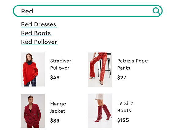
Most customers are not quite fond of scrolling for a long time (sometimes even a few minutes is too much) on the webshop in order to search products they saw somewhere on the social media, for instance. They probably want to type the name of the product and make a purchase as fast as possible. In that case, they hate long searches, and usually, it kills their wish to make a purchase.
For this reason, a search field could make the purchase process easier, where customers type a certain word, the algorithm scans the word, analyze, and offer the relevant content for that particular search. But this is not the end, as soon as the site visitor starts typing the first few characters – numerous data connected to the keyword will appear.
2.Carousel slides
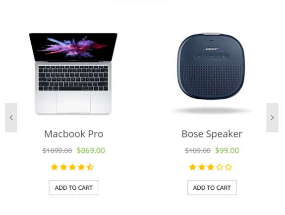
Though this is not relevant for each type of webshop, carousels are a great way to attract the attention of customers and site visitors as soon as they land on the site. This is also the way to present the best seller products and promotions, that could catch the eye of site visitors. This element is specifically valuable for providing info. The setup of this characteristic is not complicated, but it gives the opportunity to present the best and most relevant info about the company and put them on a striking top of the page.
3.Megamenu
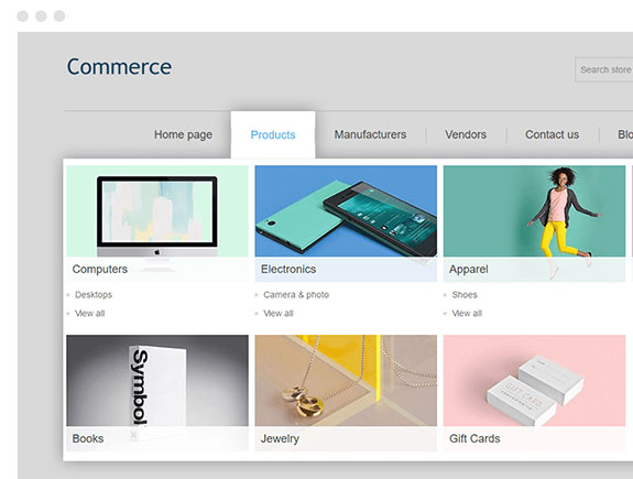
A well-designed and sophisticated drop-down menu attracts the attention of the customers, and it gives the opportunity to classify the product categories and subcategories. Customers love it as it is useful and saves time, besides it enables a good customer experience, and it gives the impression of a systematic approach in organizing products. the only thing that should not be skipped is a responsive web design version for the whole site, including the menu, so customers can go through the content on all platforms and devices.
4.Newsletter (newsletter pop-up)
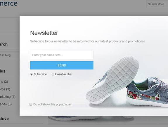
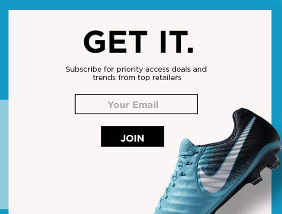
Newsletters are an excellent way to keep the connection with loyal customers. So, webshops should have a pop-up window option for newsletters (that will show up from time to time on a central part of the screen) or another solution could be a box for filling the email address at the very end of each page. Once you collect the email addresses of the customers, you can send them info on discounts and promotions. Customers will be thrilled to get info on great offers and time-limited discounts.
5.Comparing items
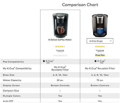
Sometimes customers want to compare the main characteristics of certain products, in order to pick the best one. A tool enabling this feature will be a fabulous addition to the website and it will enable the buyers to make fast shopping decisions. Customers enjoy comparing the products based on different aspects, as it gives them the chance to understand in a better and clear way the reasons for purchasing the chosen products. So when we add special elements on the site, it usually means we add the possibility to classify the products based on the color, sizes, weight, price, and potentially some other criteria depending on the niche.
6.Banners
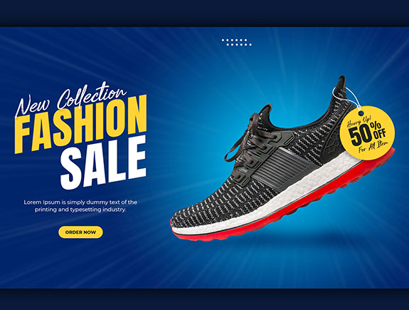
Banners placed on the first page draw attention, especially if they are animated. They can promote the content the company considers as the most appropriate one (usually these are notifications on sales, best seller products, or time-limited sales). Banners should be designed in bright colors, their look should be dynamic, and creative so the customers pay attention to them and what they promote. The desired result of placing banners is a sales increase.
8.Customer support
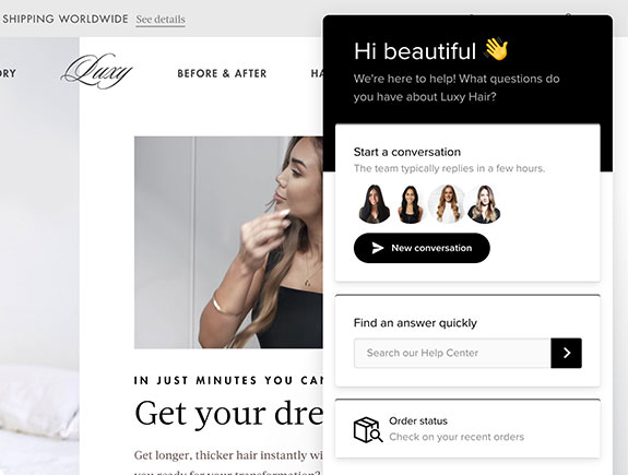
A pop-up window for customer support should be placed on each page, in case of any doubts, questions customers may have. Usually, it is placed on the right side in order to be noticeable, but at the same time to be unobtrusive and doesn’t cover the main content. When a customer clicks on it, a contact form opens where the customer can type the question, description of a potential problem. Afterward, it gets the ticket with a number, and later, the answer by email. Good customer support is another opportunity to strengthen the brand-customer relationship and strengthen the brand reputation.
9.Wish list
This element is especially popular for clothes webshops, as this way the customers get the opportunity to put their favorite articles on a wish list, so they can go back to them after some time and finish the purchase process. Besides the wish list, it would be great to share the chosen items with their friends, for example via social media. This is of particular importance for fashion influencers because they share their wish lists with their followers.
10.CTA (Call to Action)
A well-written CTA can convince a customer to make that last and most important step and click the “buy” button. This is why the CTA has to be clear, visible, placed in the right place, striking background, and on each landing page. CTA should be placed on other pages as well, so the customer doesn’t have to go to the “contact us” page to get basic contact info.
Titan Design enjoys building webshops
If you have learned something valuable in this blog post, feel free to share it with your friends and colleagues. In case you need a unique and innovative web design, contact us. Till then, you can read about the benefits of cooperating with a full-service marketing agency, questions we ask our clients before starting with web design. There are many interesting and useful posts on our blog page regarding brand development, creating websites, client relationships, and many other topics, so take a look at our blog page as you may find something worthy.
