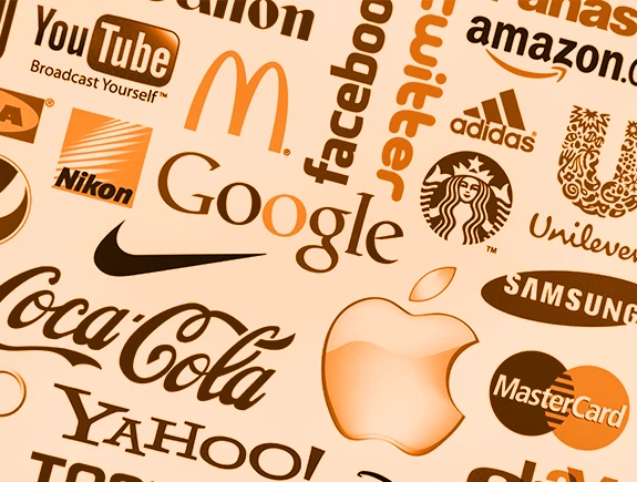
The logo is typically the first point of contact customers have with your brand. It is everywhere – on product packaging, websites, social media, business cards, and many other places. Wherever you want to promote your business, the logo should be present.
However, designing a logo that accurately represents your brand and simultaneously appeals to your target audience is not an easy task. Many business owners make typical mistakes when it comes to logos. They may not entrust its creation to designers, resulting in logos with one or more of these clear characteristics of poor logo design.
To help you avoid falling into the same trap, we highlight the 7 mistakes in logo design that can harm your brand. By applying these tips to the appearance of your logo, you will undoubtedly be proud of it and satisfied with the results it achieves with your target audience in a few years.
1. Wrong Color Choice
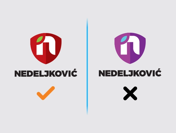
One of the most common mistakes is choosing a color that doesn’t align with the rest of the brand identity or the industry to which the products belong. Colors are powerful and should be used carefully, as they evoke different emotions and associations in people. Colors should be chosen with a purpose, not just because we personally like them. Research the meanings of colors, think about how you want your brand to be perceived by the public, and choose colors for the logo accordingly.
2. Excessive Use of Elements
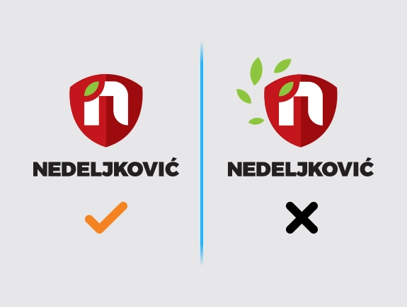
Another very common mistake is incorporating too many elements into the logo. If various, often incompatible concepts and themes are added to this mix, it results in a cluttered design that confuses.
Simple logos are always the best solution because they bring recognizability and leave a strong impression on the customer. On the other hand, trying to combine multiple ideas into one logo design only muddles the message to the target audience, which is not favorable.
It’s best to focus on one or two brand attributes and convey them in the logo. This way, the logo design will be simple, free from unnecessary elements, and easy to recognize and remember.
3. Focus on Only One Platform for Displaying the Logo
A well-designed logo should seamlessly fit all platforms, sizes, and contexts. Whether it’s displayed on social media or a billboard, it should blend in and be equally visible wherever it appears. However, some forget this and create logos with, for example, too many details. When such a logo is placed on social media, its details may not be clearly visible, making it unreadable or difficult to interpret.
4. Ignoring the Significance of Originality
Lack of originality leads down the wrong path, where the logo remains forgettable and trapped in a generic look that no one can remember. Customers view copied logo designs as a lack of creativity, and this doesn’t sit well with them.
While we all draw inspiration when creating something creative, copying is a mistake. Industry-leading brands can be a good inspiration, but they should never be copied in any way; instead, create something new based on the inspiration drawn from them.
5. Neglecting the Importance of the Empty Space
The empty space around and within the logo, which affects high aesthetics and readability, is often underutilized. This usually leads to an overcrowded logo, insufficiently clear, and highly prone to being classified as poorly designed. This impression is reinforced by a look that is cluttered from edge to edge with various ornamental elements.
However, a logo hanging in empty space without connection to other elements doesn’t make much sense and isn’t sustainable. Therefore, it’s crucial to balance white space with the size of the logo, and other elements like text, shape complexity, etc. The logo should “breathe” and not be overwhelmed. Never overlook how white space in the logo can enhance visual communication.
6. Excessive Focus on Trends
A logo should last for several years, sometimes even decades, so it’s not always the best idea to focus too much on trends. If trends are the focus, the logo is on a secure path to quickly becoming outdated and dull to the audience.
That’s why it’s important to know what makes a future-proof logo. To avoid making the logo look outdated quickly, choose a timeless aesthetic and turn to classic styles. This doesn’t mean you won’t want to refresh the logo in a few years, of course, you will, but at least initially extend that period to at least a few years.
7. Design Without Strategy
Many small businesses overlook the logo, one of the most important brand elements, while haphazardly addressing various aspects during the establishment of the business.
They tend to lump logo design into the pile of tasks without precise and clear thinking, resulting in poor outcomes. Defining foundations is essential first—target audience, brand identity, user personas, etc. This establishes a good starting point for further creative direction. Brand strategy should be consulted when contemplating logo design, as it holds all the answers.
What is important to remember from this text and which path to take?
Logo design has a tremendous impact on brand success because the right logo will attract customer’ attention, stay in their memory, and create the desired brand image. However, there are always mistakes that often lead to poor brand results. Some of the most important ones have been shared with you in this blog. If you avoid some of these mistakes in your case, your brand will be stronger from the beginning and more prepared for success in the market.
To remember from this blog:
- First, develop a clear brand strategy, and then think about the logo.
- Let simplicity be a priority to highlight one or two key brand attributes.
- Test the logo—put it in different contexts, sizes, and formats.
- Use colors and fonts with a purpose—those that will highlight your brand in the best way.
- Choose a logo that will stand the test of time—yes, the investment is worthwhile.
If you are also considering launching a brand, you should read our blog on why the logo is important for small businesses. Right after that, you might be interested in how much one logo costs, so inform yourself about it in our text. And if, in the end, you decide it’s time to create a logo, feel free to contact us, and we will suggest the best options for your brand.
