Once you have finished a logo design and your company starts using it officially on all promo materials, a logo becomes the “face” of your brand and the first thing your buyers or users of your services see when they get in touch with a product. The way that “face” is presented matters a lot, as logo redesign is not an easy thing to do, due to many logistic challenges. When you create a logo, you should take into account a vision of your brand in the present moment and ideas it might have in the future once it develops.
In the planning phase, it is important to have answers to the following question: what can we do so our logo becomes “future proof”? What direction and vision should we follow?
Context is always the most important
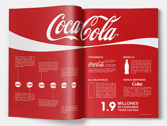
The most important thing to think about during this process is: where will the logo be used, and where will it be used in the future. This implies a broad application, from the website, business cards, notebooks, etc. Where else can you find a logo?
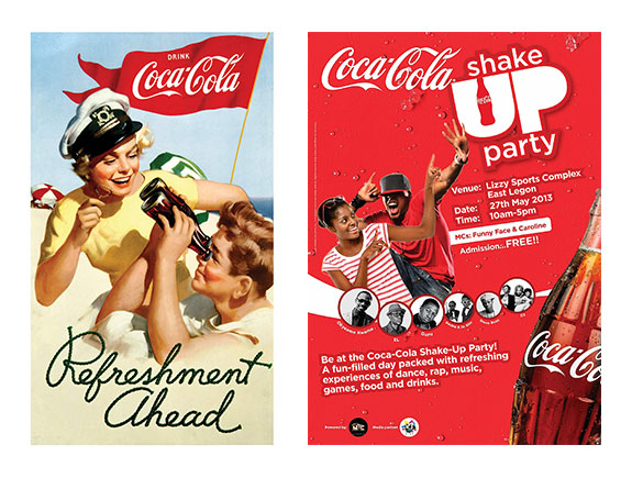
- Posters
- Presentations
- Ads
- Email signatures
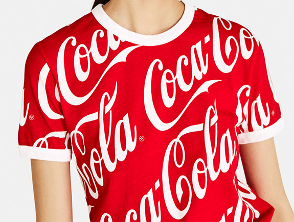
- Company uniforms
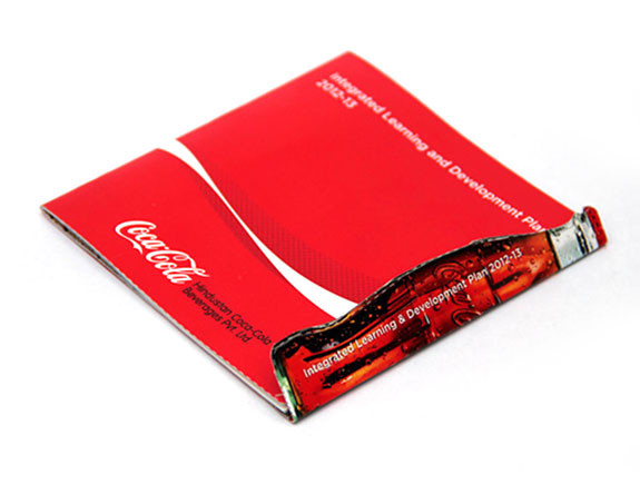
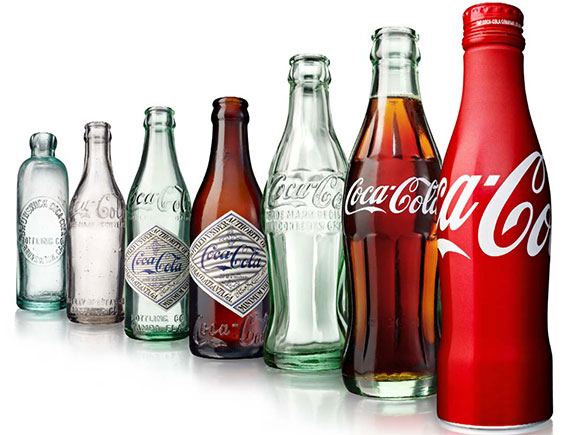
- Packaging (boxes, paper, stickers, bottles, etc.)
- Vehicles (official cars and vans)
Though the majority of small companies will not use the logo everywhere, it is still significant to think in advance and predict future situations where the logo might be used. In five, ten, or even more years, there is a possibility to expand the brand, and start, for example, selling branded clothes. In this situation, every business owner would want to have a recognizable logo, everyone will be able to remember.
Also, ten years ago, nobody could predict social media channels will become an integral part of our everyday life. Today, it seems all brands put their logo on each social media post. It is simply the most important element, that additionally remind the visitors of those profiles on the branding and make them remember the look of the logo so when they need a specific product or service, they remember the logo and find a solution to their current problem.
Size
We have all been in a situation when the client insists to get a bigger logo.
What is the proper logo size? Is it equally striking even if it’s smaller in comparison to other elements? Is there anything else, more important than logo size? Positon, perhaps? How does a logo look like in comparison to fonts, and how much should we take care of proportions?
A good designer should answer all these questions because he/she takes part in a design process and adjusts the logo due to different situations. Every client is a special case and the approach should be special too. Personalization of a design is extremely important and if you want to get a logo, tailored to your needs, just contact us.
Look
Speaking about a logo look, we should think about its shape, position and how does it fit the background. In the case of notebooks, pens, an oval logo should be a good fit. But that type of logo will not look well on a website or social media, where a logo should adjust to a given square format.
Of course, nobody says a logo should not have a few variations but it is always the best thing to keep it simple and get better brand recognition so the buyers don’t get confused.
Colors
What would be your logo background? Is it white or black? Of course, it could be any different color…but we have to think about how it fits all other colors on promo materials. Again, you should think and plan well. Good, strategic planning related to the brand and its development has to be a priority.
It assumes all the future situations where your logo will appear, for example – would it be printed in black-white combination or your budget can bear a logo in snazzy colors which implies top-notch printing conditions. So, in this case, planning your budget is important, and if the budget is not too big (which is usually the case at the starting point) then you should pick a monochromatic option, that will look well on all backgrounds.
Adjustable logo design
The simplest logo design, the more options to adjust it. A logo that looks great on the web, might not be easy to put o a jacket or hat. In other words, to use your logo for different purposes, it is important it should be simple but effective. It is not the easiest thing in this world to do but the different perspectives and simplified ideas will bring the best results. Don’t forget, what an observer (buyer or user of services) can recognize and understand, at first sight, is what makes it a good logo.
Is a redesign inevitable?
It is not recommendable to do a redesign too often as it’s not the best way of communication with the customers, these situations can happen and the most common reason is a brand refresh, innovation, and adjusting to the current trends.
Evolution is a regular process, and we are familiar with examples of many big brands, that successfully managed to change their logo without losing their popularity. Nevertheless, these changes should not be happening too often and a logo should last at least one decade.
Due to COVID19, some brands temporarily change their logos. They find ways to use the elements of their logos to emphasize the need for keeping a social distance. This is a perfect example of when companies change or adjust their logos due to current circumstances and get even more popularity.
We hope you’re all well and safe and respect the social distance. If you find this text interesting, feel free to share it with your friends and colleagues.
