In one of our previous blog posts, we wrote about upcoming trends in digital marketing, so we have decided to cover the upcoming trends in graphic design. We believe these trends will be most present on Instagram. Also, in one of our blog posts, we wrote about graphic design and digital marketing together, so you can take a look at that post as well. Based on our predictions, it seems the next year will be exciting and jolly.
Every year we are striving to predict which fonts will be popular, the new look of visuals, and it seems, this year, a few techniques will be used and mixed in one post. We will write about it a bit later. We’ll also recommend the corresponding tool for each trend in order to achieve top results. Let’s start.
#1 Advanced gradients
There is no doubt gradients are currently one of the leading Instagram trends. They represent a smooth transition from one color to the other color or color shades, or in short, it represents overlapping of colors, usually used for the background of the visuals and filling gaps.
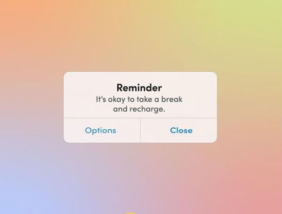
This trend is especially popular in creating visuals for Instagram stories, where pastel shades are mostly used. These colors remind us of sunset and purple sky. In this example, you can see the cosmetic brand GOLDE used this trend for IG posts.
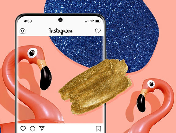
The next trend we can expect is adding attractive glitter effects and certain grainy filters. You can create this effect in Photoshop or Adobe Illustrator, but the young population prefers using filters in applications (for example VSCO) because they produce a similar effect.
#2 Color blocking in feed
This trend could be perfectly used for all our most creative ideas in one color. Another benefit, this trend brings is a very striking look of the feed all new followers will pay attention to, the first time they check your profile. Color blocking in feed brings a more coherent and professional look, in comparison to randomly published posts.
We’ve mentioned ideas done in one color, but that could be a color scheme as well in a few complementary colors, that bring the most important corporate colors of one brand. What matters is the colors fit with each other well, but one of them is usually the dominant one. Of course, it would be great to stick to this principle for some time (for example at least 12 posts, max 36 posts) so we don’t bore our followers. They like to see new and fresh content, so you should also have this in mind.
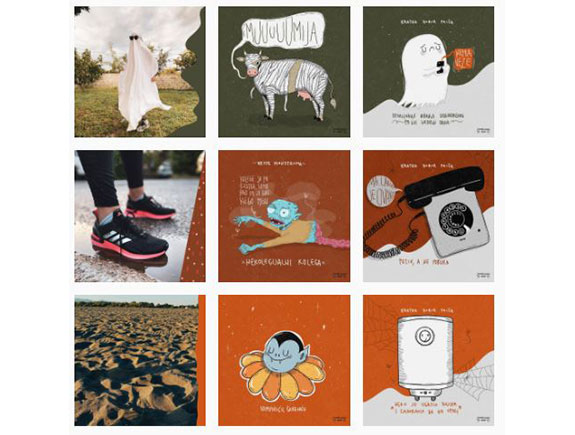
Of course, there are various combinations, so one of the posts in the same row can be a photo, then the next two with graphic elements (take a look at the example below; a famous illustrator Zombijana does it pretty well). The next row should follow the same pattern. There is another possible scenario. Posts with the same idea or topic could have a diagonal order. There are many combinations so use your creativity as much as possible.
To make this trend happen, we need a tool for planning our feed. Usually, those are applications, used for these purposes. Preview is our top choice, as we can use it both on mobile and desktop.
#3 Collages as inspiration
Mood boards have become very popular in the past few years, from personal development workshops, strategic planning of brand development or planning fashion collections for the upcoming season, etc. all these cases could potentially be an inspiration for marketers to create posts for the brand promoting ideas that stand behind launching new products.
Thanks to numerous applications (Unfold has a great section for mood board, while Storyluxe has a whole category dedicated to collages), today is possible to fit any photo in this concept, because this trend will become more and more popular. Also, the choice of fonts is practically unlimited, as almost everything fits collages, and you can add layers of several different filters.
In 2021., this trend will get additional enhancements by combining photos and sketches done by hand, handwritten text, and adding elements that look like kids’ drawings.
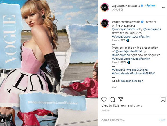
Czech Vogue gave us a fabulous illustration of how this trend could be used in the fashion industry.
#4 Designed quotes
Quotes are nothing new when it comes to Instagram, but it doesn’t mean this trend will disappear, quite the opposite, it will stay very popular and even more with time.
In the past few months, we all needed support, motivation, and lifting the mood. Quotes provided comfort, reduced anxiety, and uncertainty. Brands published quotes very often, and users shared them mutually so we supported each other this way.
This trend could be combined with the first one on our list – glitter gradients, so we can get a shiny background and powerful quote on the top. We think this works as a good combination. The good news is that you don’t have to use Adobe Illustrator or Photoshop for these posts, you can simply create them in any application in just a few minutes. Design is surely supporting here, while the quote is in the very focus and it connects followers with the brand.
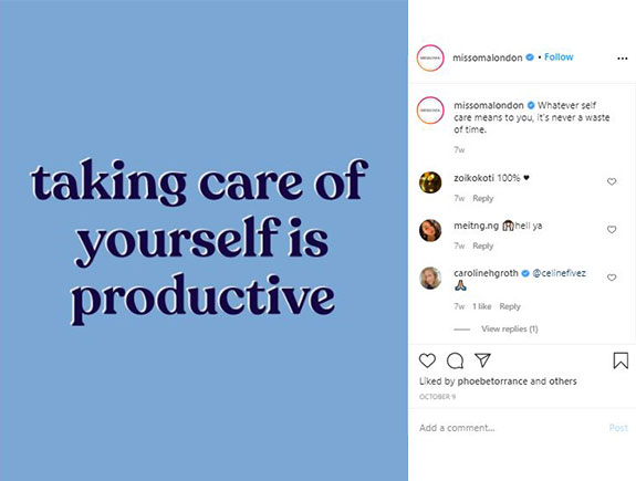
A famous jewelry brand, Missoma, made this post to remind us of the fact we should take care of ourselves, they let the message play the main role while the design is quite simple and minimalist.
Elegant Serif fonts
Fonts could dictate the aesthetics of any brand, so it is important to follow trends and choose new fonts that will bring a modern and popular look to visuals. Elegant serif trends will become popular next year. When this trend is in question, the most significant thing is a balance between power and delicacy, which will bring a sophisticated look at first sight, and the possibility to clearly read the text (which is absolutely most important to us).
It happens we recognize certain brands based on their fonts, so this is the reason each brand should have a recognizable identity and font. On Instagram, a social network based on a strong visual expression, each detail could be the crucial one, so fonts are at the very top of a list of elements the users of this network are following.
If you have access to Adobe Cloud, then you can take some of their fonts (choice is amazing) or you can always ask for professional advice from designers, as they can create unique fonts tailored for your brand.
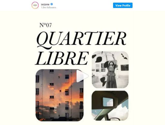
French fashion brand Sezane uses quite elegant fonts for their posts, that perfectly fit the philosophy of this brand and the overall visual identity and social media presence.
