Communication is the very essence of everything we do in creative industries, especially in marketing and graphic design. Up to 93% of everyday communication is conducted via nonverbal communication elements and channels. It’s a true fact if we observe it from the context of brands and logo design where creatives are striving to share their values, messages, and ideas of one company or individual, in the simplest possible form.
While the psychology of colors is widely known, as well as the meaning of individual colors, the situation with fonts is different. Choosing the right font and its shape could be crucial for the visual identity of any company because, in that way, it is possible to cover all flaws in the tone of one brand and its essential parts.
Whether we deal with a logo design with a ‘serious’ font chosen to emphasize the professionalism of a company or we want to design a logo with less serious lines that will emphasize the character of a brand – in both cases, fonts can be that key element for brand recognition.
Once you learn the characteristic of each font, you will be able to make an easy decision and pick the right font for the logo.
Let’s check which type is yours.
Psychology of typography – 6 different font styles
“It’s not what we say, but also how we do it” – it’s a well know rule used in marketing and all other communication means. This is the main principle in the process of selecting fonts.
For example, if you’ve been searching for a financial consulting company, and come across their logo done in Comic Sans font, this will probably leave a bad impression on you, and you will probably think they don’t care about important business elements, like logo. If a financial consulting company is using this particular font, it doesn’t look serious enough. On the other hand, if a company of this type uses a logo with Serif font, you will get an impression they are a serious company.
Maybe you’re not familiar with these fonts, so we think it’s the right moment to explain some of the key elements.
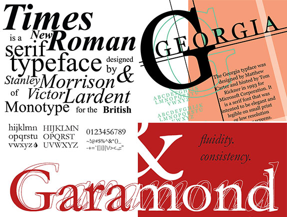
1. Psychology of Serif font
Usually, we start with traditional fonts, the ones that leave the impression of classic, sophisticated fonts. Due to these characteristics, it is often used for companies who want to incorporate a specific year into their logo. Serif fonts are classic, and they send the message of trust which makes them an ideal choice for the logos of companies who are big authorities in their own industry. These are, for example, companies from finance, education, and other niches.
The most popular ones are:
- Times New Roman
- Georgia
- Garamond
2. Psychology in the background of the serif font
Companies that strive to leave a strong impression on their consumers with their innovative or intuitive products, like car companies or gadget companies, want to leave a strong impression on their customers, build trust and present themselves as modern and creative.
Some of the most common fonts from this group are:
- Courier
- Rockwell
- Museo
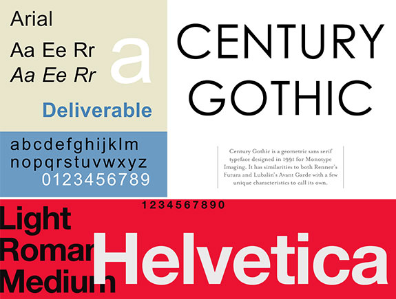
3. Sans serif fonts and their psychology
These are clean and modern fonts, used for easy-going communication with clients. Brands directed to their consumers and meeting goals are mostly the ones who use these fonts.
Usage of these fonts should associate a fair approach to consumers and the feeling a brand understands consumers’ needs. There are no decorative elements that could be distractive or send a vague message.
Usually, fashion companies use this font for their brands but also the modern tech companies.
The most popular fonts from this group are:
- Arial
- Century Gothic
- Helvetica
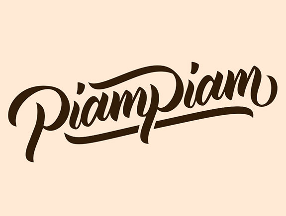
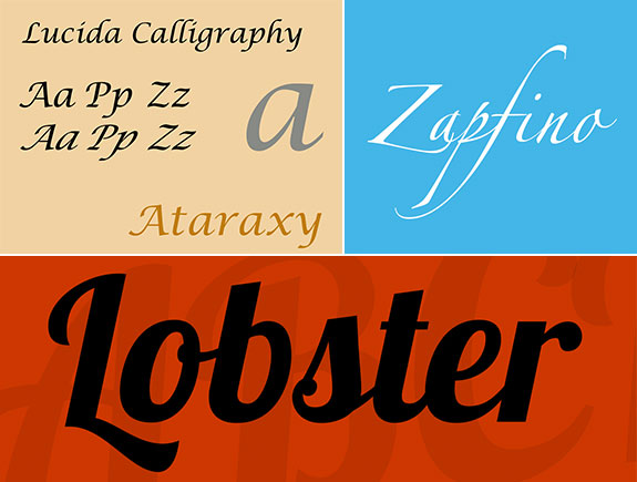
4. Fonts with written letters
These fonts look much more sophisticated than sans serif fonts. They could be used for promoting characteristics such as femininity, elegancy, creativity because they look as if hand-written. If the main goal of the client’s brand is to leave the impression of connection with consumers, building personal bonds – then you should pick exactly this group of fonts in creating logos.
Based on the psychology of these fonts, they are used to stir inspiration and creativity. It is especially useful with brands that are trying to present themselves as creative and the ones that want to trigger an adventurous spirit. Though they look artistic, hand-written fonts could have low readability, so you should keep that fact in mind too.
Some of the most commonly used fonts from this group are:
- Lucida Script
- Lobster
- Zapfino
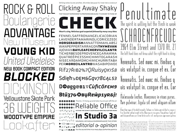
5. Modern fonts
These fonts are designed to be simple and readable, modern, and to include thin and thick overlaps between letters.
When we use them for logo designs, they should represent exclusivity, an intelligent approach, and the feeling the style matters. These fonts achieve good results in attracting the attention of millennials because this logo is used for the Facebook logo.
Examples of these fonts:
- Politica
- Klavika
- Matchbook
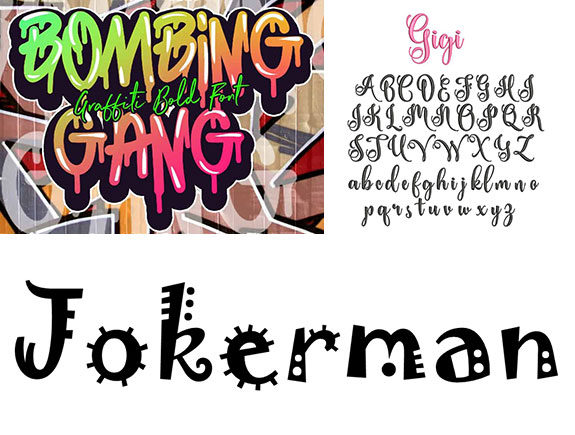
6. Decorative fonts
Finally, if you want a creative font for your logo, this group is the right fit for you. These fonts are unique and often made for specific occasions. They break the rules and are one of the most popular in creating logos.
First of all, they are minimalist and highly stylized and give a character to each logo. On the other hand, they bring a personal and special connection with consumers. By twisting certain parts on the logo, typography done in this style gives a special look to the logo and presents the company as fun and unique.
Some of the most commonly used fonts from this group are:
- Bombing
- Gigi
- Jokerman
How do we choose the right font?
Because the first impression matters a lot, you cannot skip the chance to pick the right font, the one that will help you to connect with your target audience in the best possible way. Choose carefully, because it might be that tiny difference that distinguishes you from the competition, and the one that will bring you the first position among the consumers within your niche.
Though some people give priority to colors, typography and fonts are crucial elements too. Let’s take the example of Coca-Cola. The logo points out the equal significance of colors and font. Matching these two elements is very important as it may bring success and recognition just as it did to this world-famous brand.
Choose carefully, and if you need a logo design or creating a visual identity – we are there for you, book a meeting and talk to our designers.
If you liked this blog post, share it with someone who might find it valuable.
