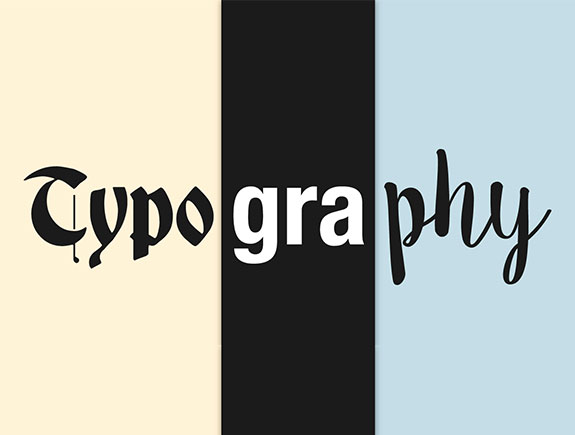
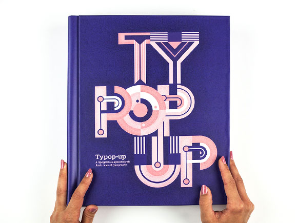
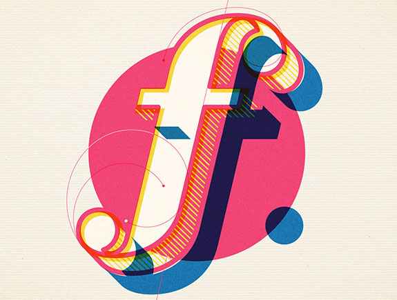
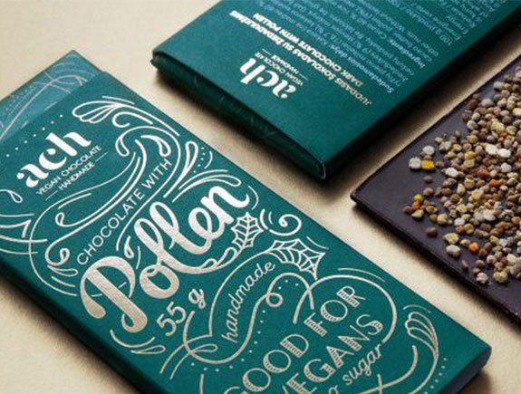
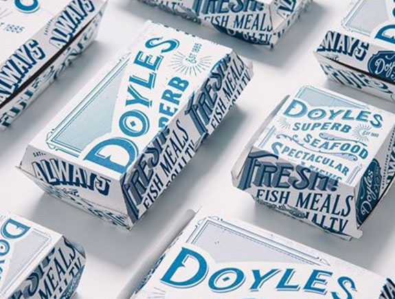
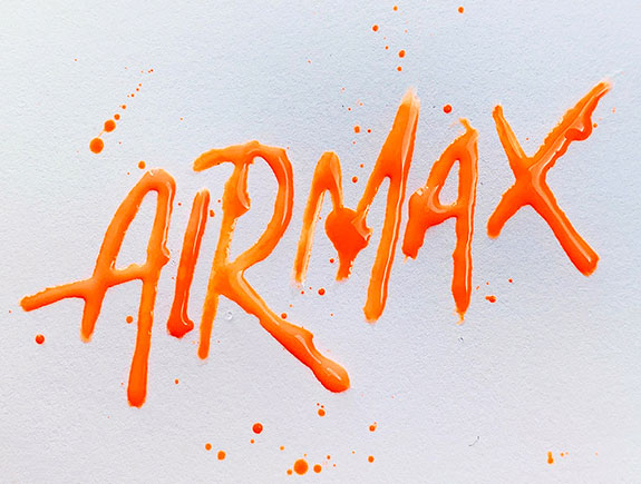
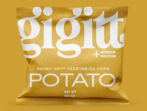
It is impossible to imagine graphic design without typography. Using typographic elements in creating various visuals is crucial because they are leading elements in the visuals. Textual visuals are popular in the last few years so a thorough knowledge of typography is important for each designer. To share a brand message to its consumers in the best possible way, a designer must be an expert in letters, fonts, and their usage.
Typography is everywhere around us. If you pay attention to posters, billboards, brochures, logos, or websites, you can notice the efforts involved to emphasize the look of a textual part, and colors to emphasize certain text sections.
In current business surroundings, consumers are exposed to loads of messages, ads, visuals. Designers are the ones who should help a brand to stand out, share the message, and connect with consumers. This is not an easy task, but it is certainly easy to perform it and build a recognizable brand whose letters and their shape will be recognizable.
What is typography?
To explain this term in the simplest way, we could say it’s a skill of combining letters, rows, sizes, fonts, etc. graphic designers use typography to arrange the look and position of text on a visual. It helps them in creating content with a high use-value, and a sophisticated and appealing appearance.
Designers use typography strategically to make a readable text, and leave an impression on consumers. This enables a brand to communicate with its target audience in an efficient way, using its full potential.
Let’s check the key reasons to understand why typography is so important for graphic designers.
2. Typography attracts attention
In the last few years, the attention span of consumers has been decreasing. The latest studies show the average attention span is less than 10 seconds. If brands tend to sell a product or a service, they need to grab the attention in a fast turnaround time.
Graphic designers use their skills to help brands stand out from the competition in just a few seconds. Taking into consideration different available shapes in typography, sizes, and styles, these textual elements are an essential part of the overall impressions and make a unique design.
2. Typography makes the text readable
Carefully chosen typography enables site visitors to navigate through the text easily, whether it’s a blog post to a landing page copy. If we choose the wrong font, it can make the whole presentation unreadable, chaotic and this will certainly refuse the site visitors from visiting that web page.
If we take small fonts into consideration, they are mostly unreadable, which creates tension and repels website visitors from staying on the website. Despite the fantastic design of other elements, they won’t bring value and convince the visitors to stay on the site due to unreadable and small fonts.
3. Typography establishes a hierarchy
An experienced graphic designer with lots of working experience and skills will know how to use different fonts and their types to attract the attention of site visitors and direct it to the most important information. In this case, a site visitor can quickly get needed information, in just a few minutes. To make the text readable and acceptable for site visitors, a designer should use different fonts for subtitles titles, and other parts of a text.
4. Typography builds recognition
Brand recognition is the most important means for any company to fight for the attention of consumers and against the competition. In graphic design, you can target potential buyers with fonts, and they are the potential reason your consumers will remember you forever.
Many famous brands based their logos on typography. Maybe that could be one of the reasons the consumers recognize them and buy their products. Coca-Cola, Google, Disney are great examples of companies standing out with their typography logos.
5. Typography provides the value and general brand tone
Typography is an important tool you can turn to when it comes to communicating values and brand tone. Each typographic element has the power to present, in a different way the business company deals with, and the values it promotes. Exactly, for this reason, there are different fonts to be used in order to trigger the mood, certain effects, etc.
Let’s take as an example fonts without serif parts. They should provide a simple and clean design, that will enable readability. These fonts are considered to be modern, but graphic designers don’t recognize them as the best choice for blogs or books, so in these cases, they pick serif font although they are considered to be a bit old-fashioned.
6. Typography creates harmony
Graphic designers often use typography to establish harmony and balance on a certain visual. The harmonious design creates an artistic impression on website visitors. They are trying to use the same font for topics of similar content, so the visitors could recognize them. This way the air of continuity is created, which sparks off the calming effect on blog readers, and produces an urge for continuous site visits.
7. Typography gives a character to design
One of the main characteristics of typography is to provide the character to each visual. In other words, depending on the fonts a designer has chosen, your website could have a friendly look, serious look, playful, sophisticated, etc.
Just like colors, fonts send clear messages and define what kind of a brand we want to present to consumers. Searching for a proper logo or web page font is not an easy job but certainly the most important one if a brand wants a balanced and unique design.
Finally, what is the main message of Titan designers?
Typography is a key element that brings design to the next level and gives a more personal meaning to design. From the point of view of designers, typography is a tool we use to put the text in a certain visual and share a brand message to its consumers. Typography is also crucial as a great way to attract the attention of consumers via visual communication.
If you think your logo or visual identity could dominate in comparison to the competition, due to strong typographic elements – contact us, and book a meeting with our designers. We are sure they will have great suggestions for you.
If you liked this text and think some of your friends or colleagues could find it valuable – share it with your friends and colleagues.
