Whether you need a logo design or a book cover, trends are something that all designers rely on in their work. And no matter how nice some trends look now, in a year they can be outdated. Then you will wish you had chosen better and maybe turned to some other trends. However, there are timeless trends, which bring sophisticated and classic looks for many years. They are exactly the perfect choice for you if you want a design that will last a long time and will not be burdened by trends.
Trend vs. timeless design
The eternal dilemma of designers, but also of clients – whether to choose modern or stick to the classics? Should you play it safe or do a redesign for a few years? Should you choose one of the logo design trends in 2022 or choose one of the three that we will present below?
If you opt for the classics, then you are choosing a design that will work for all occasions, seasons, etc. It will last for years, because it is so real, without the influence of the transient and with the desire to last for a long time.
There are many problems with following trends but is a good approach if you have the will and money to deal with it. However, if you’re just starting out in business, it’s important to focus your energy on growing your business, so it’s much better to choose a logo design that will last longer. That doesn’t mean you won’t redesign it at some point, but while you’re at the very beginning, you won’t have to worry about its appearance.
Now let’s take a closer look at three trends you can’t make a mistake with, and the ones that will be present on the design scene for a long time to come.
1.Geometric shapes
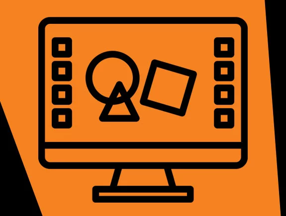
Geometric shapes can be used in graphic design in many ways. Different forms can be used with different meanings. For example, a circle can mean closure, but also that something has no beginning and no end. A brand that wants to present itself as timeless can easily do so by using a circle in its logo.
When it comes to triangles, they can represent action, but also warning, and tension. The brand will present itself as stable and strong, if it uses a correct position of a triangle in the logo, while the upside-down triangle is just the opposite. Rectangles and squares show equality and security. They are also an excellent element if you want to stand out in front of the audience and be recognizable.
But for that, you need not only geometric shapes, but you can set them as a base and then add other elements on top of them. For example, if you add flowers to the edges of the circle, the brand logo will look striking. This is a great way for a natural cosmetics brand to get a classic, yet appealing logo.
And to know which logo looks good and which doesn’t be sure to read our post on 7 clear signs of bad logo design. Here you will find out what you should pay attention to when designing one of the 5 key elements of building a brand identity.
2.Simplicity
And while minimalism became popular in 2015, and has always held an important place in trend reports ever since, simplicity as a trend is timeless. Simple design is something that can be incorporated into web and logo design as well. It can also look great when it comes to packaging design. This feature comes from the fact that the simple design is at the same time impressive, but not too offensive.
Focusing on one element or at most two makes it possible for the viewer to remember the design easily. If that element is text, it will be easier to read because of its simplicity. Communicating any message, with a simple design, is not difficult. Then the focus is only on the message, and other elements are minimally represented, and there is no room for misinterpretation of the symbolism of the design.
As long as simple elements are combined with the right colors, the design has the potential to be timeless and stand out from the competition. Then the target group, to whom the design is intended, will easily remember it, adopt it, and will be returning to the brand for a long time.
3.Typography that attracts attention
If you want a design that will stop social media users as they scroll through content, then choosing striking typographic elements is the right approach. Everything has already been seen on social networks, but a well-designed message text cannot leave anyone indifferent.
In today’s world of modern technologies and social networks, where no one has too much patience, it is important to attract the attention of the target group. Luckily, attention-grabbing typography has the potential to be up to the task. So, with the use of different fonts (large or striking) you can achieve a great effect, which will gain the attention of your customers.
Timeless graphic design is always a winning formula
We at Titan know that sometimes it’s better to go for a timeless design than to chase trends too much. Of course, it also depends on the wishes of the clients, but we always try to explain why the trend is good, but also its flaws. On the other hand, we also explain the advantages of using one of the above-mentioned timeless trends, which can go well with some industries and brands.
If you are looking for a full-service marketing agency that will deal with your brand, everything from the design of its basic elements, through its construction, to advertising on social networks – we are at your disposal with our knowledge. Contact us, and you will find the best designers in our agency, who will know what type of design best suits the needs of your brand.
