In 2021., logo designers have made a big step towards innovative and bolder design. What does it mean in reality? They used intensive color palettes, experimented with animations, typography, shapes, worked on modernizing symbols, and improved the combination of simple geometric forms.
You can read about some of those trends in our overview about top logo design trends in 2021., and realize how interesting the previous year was in the graphic and logo design niche. It is time to focus on this year’s trends and novelties.
In 2022., logo design trends have a tendency to rely on last year’s trends, though we expect the novelties too that will shake the global scene. We have to emphasize it was easier previously to make a difference between modern logo design and outdated logo. Nowadays, things are drastically changing – it means you can see 3D logos and common logos everywhere, the ones with a minimalist look, but also the ones that look as if they came out of Japanese anima movies.
One thing is sure – it seems one trend is continuing in 2022. – unlimited freedom of expressing creativity and choice of forms. We look forward to it! Let’s check the leading trends for this year.
1.Simple geometry and basic shapes
In 2022. we are getting back to simple forms because it turned out the clients have difficulties in establishing relationships and remembering brands with complex logos. That could be a problem for big brands aiming to increase their visibility and presence on the market. So it happens they want simple logos, the ones with clear shapes and aims to simplicity, quite the opposite to complexity.
Basic geometry shapes are triangles, circles, squares, lines, and dots, enabling a simple logo design. The principle “less is more” is used by many famous brands. They use simple shapes in their logos, which makes it an interesting choice of intense colors or even more minimalist by using a black-white color scheme.
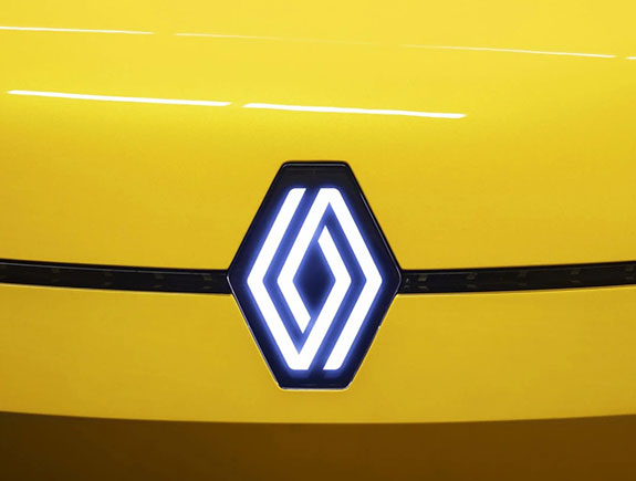
Last year we wrote about the new Reno logo. They chose the minimalistic choice of shapes and colors. Volvo and Kia redesigned their logos as well and followed a similar logic.
2.Tall logos
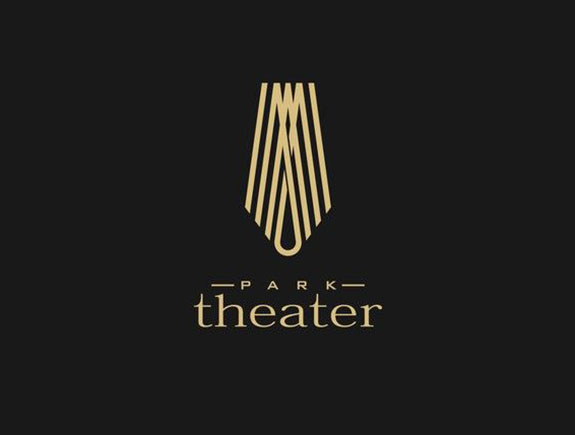
Though most trends in 2022., present something we have already been seeing these years, the next trend is a real refreshment in a creative sense. Tall and narrow logos are quite the opposite in comparison to the overused horizontal, round, or square logos. If we take a sneak peek at the Behance designer world, we can see fashion brands and creative studios find this trend very popular, as well as brands who want to open to new forms and shapes.
If we wonder about the origin of tall logos – the answer is in Art Deco art direction and its special dedication and love towards elegant vertical frames. Also, boho aesthetics, increasingly popular in the last few years, can be connected with this trend.
Regardless of the source of inspiration for this shape, it looks like this change will bring a brand new way of fitting typography and other elements. We also believe this type of logo perfectly fits the online world, especially because there is no need to work on more versions for sake of responsive design on different platforms.
3.Sketches and drawings
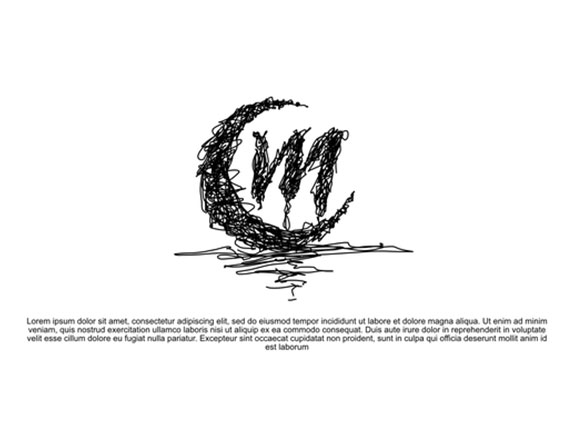
In 2022., sketches and drawings are becoming popular again. Though this trend may look like a child’s naive drawings, this trend is in fact something more serious and creative. The key to its success is in its unique approach. It seems there’s nothing better than fast drawings and lines are done in a unique way.
Though most designers have been following a minimalist approach in the past few years, we still like the logos made based on this trend due to their playfulness. This could be an excellent choice for some companies, because a designer receives a lot of space to express creativity as much as possible, at the same time to point out all special characteristics of a brand in a design, creating a different logo that stands out from others.
4.High color saturation and gradients on a logo
The story with colors and their choice for logo design is more individual than it could be labeled as a trend because the client is the one who picks a logo in intense colors or minimalist black & white version. If we take a look at big world brands, we can notice they gladly pick colors for their logos.
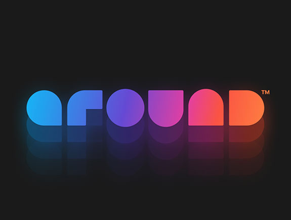
The formula is often the following – color choice is a bit bolder, saturation emphasized to maximum, while logo shape should be as simple as possible. A combination of too many colors and details often triggers a negative reaction, so it is important to choose one direction. Either strong colors or complex design but never both together.
Sometimes, this trend (if neon colors are used or the ones from a candy palette) could appear as cheap, so you should be careful with color choice. Another aspect of this trend is gradients (popular in 2020.). We have never thought they would come back but we were wrong. Either you love them or not. The choice is up to you.
Which trend will stay in 2021.?
For sure, it is animation – the star of trend report from 2021. Though it was one of the favorite trends last year, and it certainly had its bright moments, it will stay in the past. The reason is probably the fact animation is only applicable to digital, and not all the people like that fact.
We hope you like our predictions for 2022. trends and we also hope most of them are correct. If you find this blog post interesting or you want to share and comment with your colleagues, feel free to share it. We look forward to another creative and jolly year.
