Everyone who needs design services might happen they don’t understand any of the frequently used design terms. It’s a similar situation as with marketing terms, we explained in one of our previous blogs. There are graphic design terms designers need to understand the project and create a solution for a certain brand or campaign, but these terms are relatively unfamiliar to clients. These terms use freelance designers but also marketers creating posts for social networks. They understand themselves well but what about clients?
For all who don’t understand the meaning of the following terms: kerning, warm and cool colors, Pantone, gradients, etc., we have decided to write a blog post with the 25 most commonly used design terms, explained in a very clear and simple language. We hope our client will learn from this blog post and be able to understand better our creative solutions.
1.Typography
Typography is a visual component of a written word, or simply said, the art of fitting letters, numbers, and symbols so it looks appealing on printed material, books, billboards, or any other digital forms. It doesn’t relate to fonts only but also to the way the letters, numbers, and symbols are arranged on a page, including the spacing between them, sizes.
2.Rule of Thirds
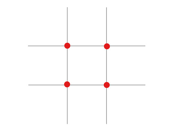
Based on the rule of thirds, if you split the image with two vertical and two horizontal lines, the touching points where these lines are meeting mark the borders of the main focus on that image. Why is this important? Because of proper focusing. This rule is used on a daily basis but most people don’t know anything about it, though they see it every day in applications for photo editing, and for example on Instagram.
3.Display Type
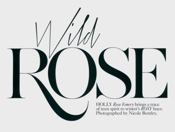
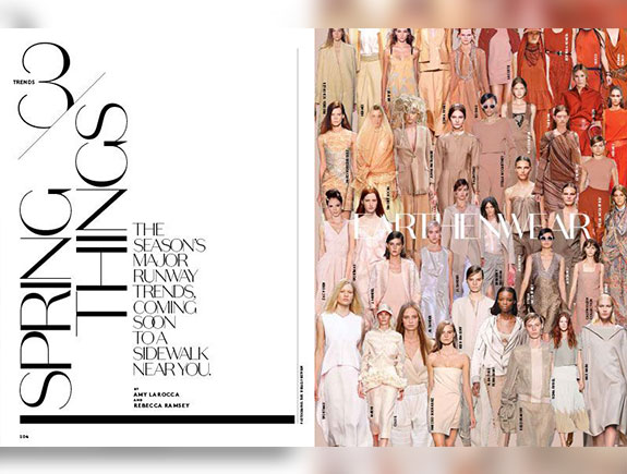
Typographic elements are made to attract the attention of its observers. Such visual can be created for printed material (we can see such visuals in magazines or books; think about newspaper headlines, article titles in magazines, etc.,) but websites too, where headlines can be striking too. In this example, we can see how fashion magazines emphasize the text and make it look more appealing.
4.Hierarchy
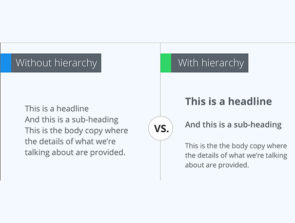
Visual hierarchy means arranging graphic elements according to priorities. Headline, subtitles, text body are arranged so the most important part is emphasized. To achieve this, bigger fonts are used in bold, and keywords are marked in a different color. This way, the reader can understand where is the beginning and end of each paragraph, and identify certain important information in the text, and generally easily read the content.
Typographic hierarchy is the most important part of any design or outline of a designed page, and even if you haven’t heard for this term, you saw it on websites, newspapers, or magazines.
5.Kerning
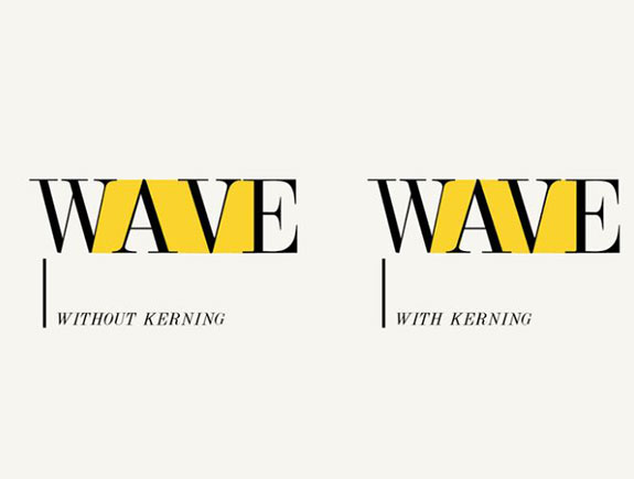
Adjusting the spacing between two letters, numbers, or any other elements. Kerning is a very popular and often used term. Usually, its goal is getting better proportions and good-looking text, so the spacing between letters or any other elements in the text can be in a perfect balance. This example shows how easy is to make a mistake with wrong spacing.
6.Serif Typeface
We have already spoken about fonts, in one of our blog posts, where we explained the meaning of six different font styles.
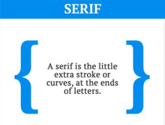
Serif fonts can be recognized by small, decorative curves, visible on horizontal and vertical lines. As it looks traditional, professional, and serious, it is often used in magazines, bank logos, and similar traditional institutions.
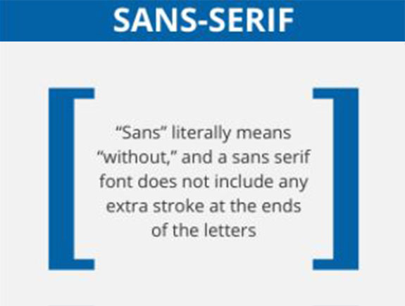
7. Sans Serif
Sans means without. In other words, letters written with this font don’t have any decorative curves. This gives a modern and stylish look. This font is often used in the fashion industry.
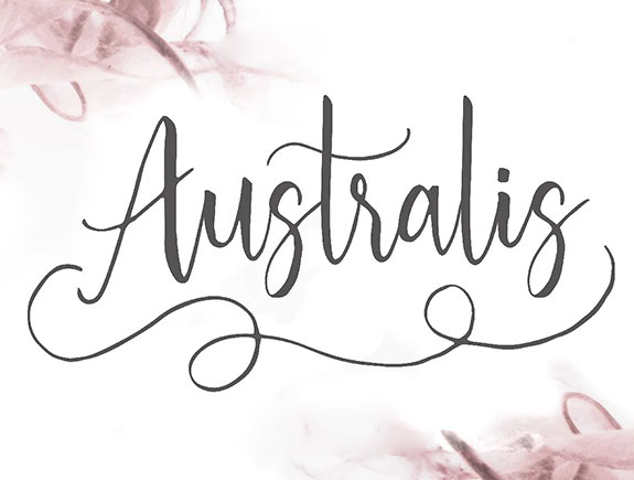
8. Script Typeface
This type of font looks like handwriting. It is elegant, sophisticated, less formal in comparison to the previous two. But, sometimes these fonts lack legibility, so you should be careful with using these fonts.
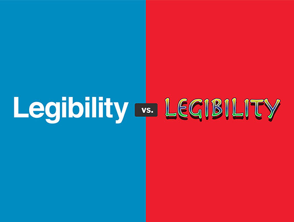
9. Legibility
Legibility is important when it comes to texts. The speed needed to distinguish the words and scan the text is crucial for text legibility. This depends on the fonts choice, the way we use them, for example, you can place serif and sans fonts in small text boxes.
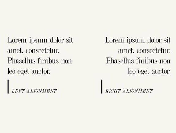
10. Alignment
Aligning elements to reach the balance, order, and logical look of the text is important so the text reaches the proper symmetry so as to be aligned in any of the four ways – left, right, center, justify.
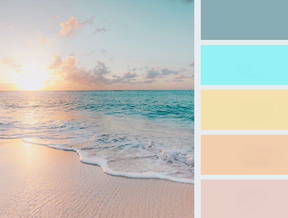
11.Palette
Selection of colors chosen for any purpose needed for brand presentation (it could be a design of a visual identity, design of printed material, posts on social media, web design, etc.) colors arranged in one palette should be in harmony and fit with each other.
12.Monochrome
The monochromatic color scheme presents one color and its darker and brighter options. Photographs or visuals can be monochromatic. One of these combinations could be seen on social networks, where monochromatic variations are part of special filters in individual colors (pink, blue, green, or simple black-white, etc.)
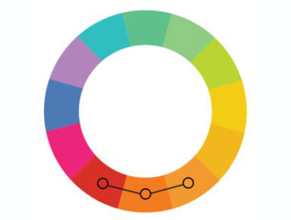
13.Analogous
The analogous color scheme consists of colors together in a spectrum (three of them). Usually, they fit well and make a balanced and calming design and color combination.
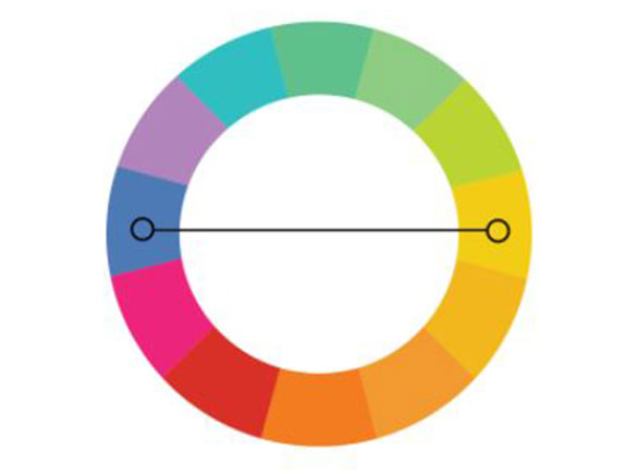
14. Complementary
Complementary colors are on different sides of the spectrum (blue and yellow or red and green). We use them to make a contrast in design and highlight certain elements with this color choice.
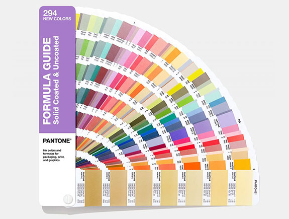
15. Pantone (PMS)
Pantone Matching System is a standardized system of colors dedicated to printing. Each Pantone variation has its number, so designers could work easily and choose specific variations they need. Every year Pantone announces the most popular color for the next season and then everyone talks about it for days on the internet. Sometimes, but not that often, it happens two colors are announced for the upcoming season. It happened this year and in 2016. when pink and blue were top colors. This year, Pantone top colors for 2021. are grey and light yellow.
16. Gradient
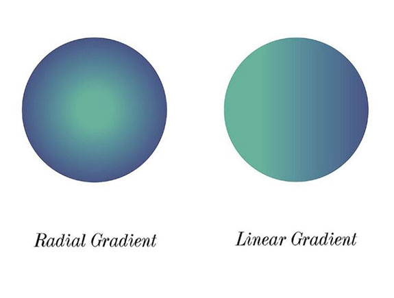
A gradual change of color from one tone to another (for example green to blue). Two common color changes are linear gradients where each color stands on the opposite side of a frame, and radial gradient where one color is in the middle, and another one at the verge of a specific element that fills it.
17. Opacity
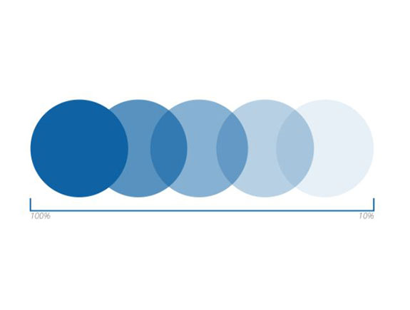
It is the level of transparency an element has. The lower opacity, the more transparent the element is. If opacity is 100% the element is completely colored and visible.
18. Resolution
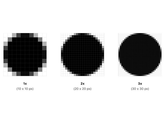
Resolution is the number of details we can on a photo. The higher it is, the more details we will be able to see and the photo will be clear, while the one with less resolution will be blurred.
19. Saturation
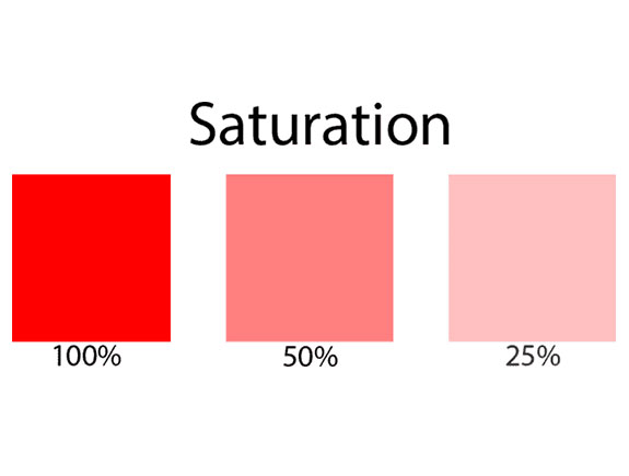
The level of intensity and clarity of any color. For example, low saturation means the color will look pale while high saturation means the color will be vivid.
20. Stock Photo
Professional photos. You can purchase them or download for free on certain websites and use them for commercial purposes. Designers use them for creating posts on social networks, like backgrounds, etc. one of the sites with a great archive of free photos is Unsplash. There are many similar sites so it is very easy to find good-quality photos.
21.Brand Identity
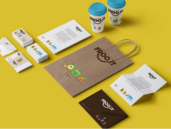
Visual identity of a brand representing its values, goals, and mission. You can read about how we created the visual brand identity in our blog post about O’cedi juices. Visual identity assumes elements such as logotype, memo, business cards, etc. it is very important for a general impression about a brand or company.
22. Logotype & Logomark
Many people confuse logotype and logo and consider them as synonyms. But logotype is a name of a company designed in a unique way, while logomark presents an abstract presentation of a company via a specific symbol or sign. Yes, sometimes a company has a logotype only presenting the logo at the same time, while some brands/companies do it separately.
23. White Space
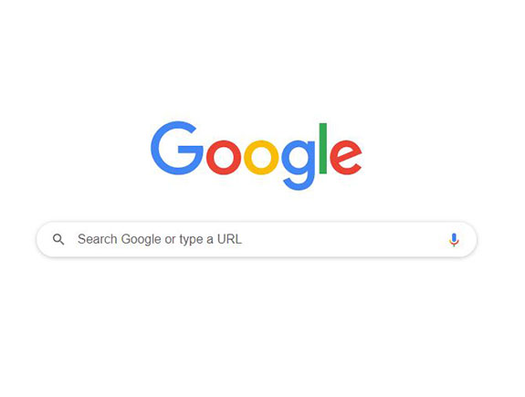
Also labeled as negative space and assumes design parts without any content. White space is very important for design because it highlights specific elements in a proper way so the overall visual look great.
A good example is the intro Google page, where white color uses most of the space and in this way invites the user to focus on a central part where the visitors should type a searching term.
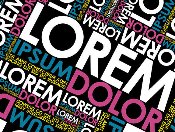
24. Lorem Ipsum
Know as that dumb generic copy used to fill the page when the real text is still missing. In fact, this text is used as an example so the client can see how font and design will look like in the final version.
24. Lorem Ipsum
Know as that dumb generic copy used to fill the page when the real text is still missing. In fact, this text is used as an example so the client can see how font and design will look like in the final version.
25. Grid
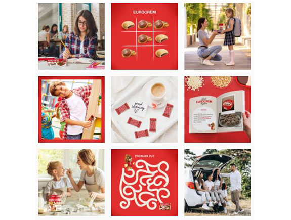
A grid consists of equally separated columns and rows. The purpose of a grid is to help a designer to arrange the elements in the best possible way. Grid is also familiar as a term on a social network Instagram where you can use it to plan and organize your feed, share photos or visuals on several fields, etc. grid may consist of three horizontal fields, six or nine.
A great example is our client, Eurocrem, where the Instagram content is well planned.
We hope you’ve learned something new, by reading this blog post. Feel free to share it with your friends. If you want us to create a unique visual identity or logo, contact us.
You can also read our other texts on our Blog page.
