Project Brief
Industry: Organic food sales on the online shop and in stores in Belgrade
Client: Organico
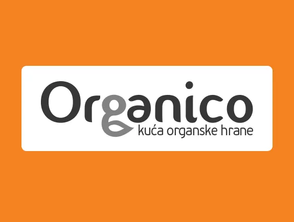
Service our agency provided: logotype redesign
Goal: Creating a new, recognizable logo that customers will easily remember
About the client
Organico is the largest distributor of certified organic products in Serbia and has been successfully selling organic products for years in its online shop and in several stores in Belgrade.
Since they opened the first store in 2015, they have been constantly growing and expanding their retail network. Currently, they have seven retail stores, but they wish to increase that number. In addition, they also have a wholesale business, for supplying large retail chains and organic product stores throughout Serbia.
The growth of the company and its development are the reason why they wanted to adapt their logo to new needs and bring an improved, fresh solution to their new, but also to their old, loyal customers.
A challenge that was put before our designers
The client asked our designers to redesign their old logo so that it would be different than before, simpler, and clearer.
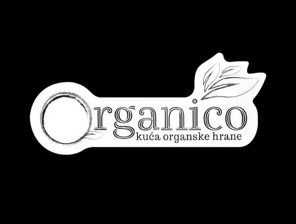
The problem with the previous logo is that it had nice but not very practical details. It was the details, in the form of leaves on the letter “O” and above the last three letters of the brand name that looked like they were drawn by hand, that were the main problem to solve.
Namely, the readability and applicability of this logo on different media were problematic. Starting with paper, all the way to billboards, but on the other hand, its application on web banners and the website. Pixels, sizes, different formats, and the old logo didn’t understand each other, so it was difficult to be use either offline or online.
In addition, the previous logo was not “iconic” enough, neither recognizable nor simple, so customers could not remember it. That is why a new logo with the following characteristics was needed: distinctive, adapted to the target group, and simplified.
The solution
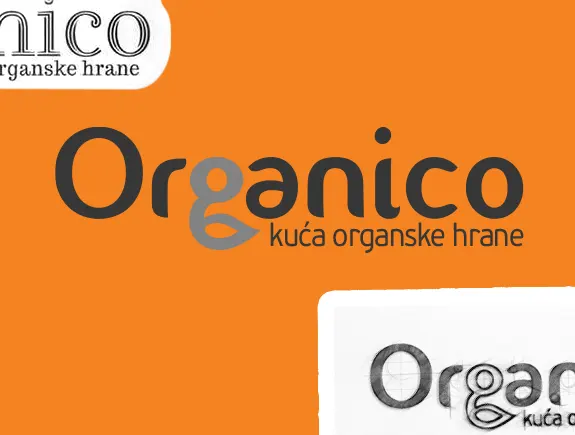
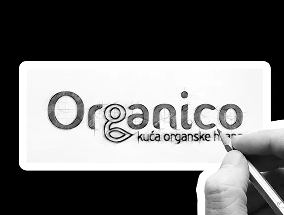
Our designers have developed a solution in accordance with the brief, which now meets the client’s needs and which, above all, is super simple, recognizable, and easy to remember. They created a new logotype in accordance with the needs of the target group, knowing that such a graphic solution would be recognized by customers and adopted very quickly. So what did we achieve by creating the new logotype for Organico?
- We created simple and applicable solutions, for all surfaces and all formats,
- We highlighted green as the main color on the new logotype, because it represents the primary association of customers with healthy, organic, and natural food,
- We kept the leaf element, which existed on the previous logotype, but incorporated it into the brand name,
- Light green was used to further emphasize the element of the leaf, which is located on the letter “G”,
- We decided on a recognizable typographic solution, instead of using an icon, so that the brand name would be in the first plan, but also in order to additionally emphasize the slogan of the company “house of organic food”.
The result
The company Organico got a modern logotype, which already brings greater brand recognition among the target group than was the case before. By branding their stores, website, and social media accounts (FB and IG) with a new logotype, they managed to stand out from the competition, and customers began to clearly recognize them and remember their logo.
Customer impressions
The logo is much simpler than the previous one and customers can easily recognize and remember it. We have received a logotype for the next chapter of our company’s development. Cooperation with the design team and the agency was easy and we quickly came to the desired solution.
