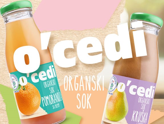
O’cedi juices are new organic juices in the market which have yet to position themselves and find their way to consumers. What sets them apart from other juices is the fact that they are produced from 100% squeezed fruit that was organically grown, that the juice is not diluted with water, and that it contains no sugar, additives, preservatives, or any other harmful ingredients.
Up to seven different tastes of O’cedi juices – apple, orange, tomato, pear, blackberry, raspberry, and sour cherry – bring a variety and diversity of offerings to future customers in precisely 430 g of squeezed fruit, as is required for each and every bottle.
The goal we wanted to achieve – the goal is to attract customers’ attention through a compelling logo and packaging design and to highlight the most important comparative advantages of this product. In addition to the look of the packaging and the product logo, the client has also entrusted us with a very important task, which is to come up with the name of the juice.
We worked particularly hard on that particular task and the goal we wanted to achieve was to come up with a name that is striking, memorable, short but also to the point. We were thinking about which of the characteristics of this juice should be emphasized in the name so that a clear message would be sent to the customers.
Our target group has included young people between 25 and 35 years of age, who understand and can appreciate our playful use of punctuation marks, which was supposed to create a sense of playfulness that is visually compelling enough to get customers’ attention. The reaction we expected was: “That is really cool, interesting, different …”
The concept – in order to achieve our goals that will make this juice stand out visually, we have divided this project into five tasks:
- To come up with a name for the product –so, nothing can replace good old brainstorming. We passed a brief to our colleagues who were tasked with designing the product name, and they set about thinking and looking for the key characteristics of the juice that should be highlighted. The client chose ‘O’cedi’ from among the ten offered name propositions, because he felt that that particular solution was the best at pointing out that it was a 100% squeezed juice.
- The visual identity –everything from colors, fonts, elements, and shapes… The colleagues who were given this task conducted research on all those items individually and made a decision about what the visual identity should look like. If you were to describe it in words, then freshness and color are the two most essential characteristics to emphasize.
- A packaging design proposal –another product-related task that will further affect the customers’ impression of it. We were very well aware of that, and so we decided to use colors that would contrast the color of the juice, thus achieving an effective composition that emphasizes not only the product but also the design. As for the lid, we chose green as a symbol of nature and organic food, and to further emphasize the fact that the product was organically produced, we also used the national seal for food thus produced.
- The type of the label paper –a purely technical matter, according to many, but not to our designers, who have meticulously approached and selected the best label paper. The label design itself follows the general visual identity, logo, and colors of the product.
- Creating a logo –certainly one of the most important elements of a visual identity is a logo. We took that as an initial idea and paid due attention to it while designing the logo. Fonts and colors follow the general idea of the visual identity, with the very name of the juice being in the foreground, as we wanted to give further importance to that interesting and playful use of characters within the name. The idea was to slip the stem of each fruit through the letter O in order to further emphasize the fact that the juices were made from 100% squeezed organic fruit.
Titan’s solutions for O’cedi
Below you will find our visual solutions for O’cedi juice. We hope that you liked our first in a series of case study texts, and that you will continue to follow our blog in the future. If you find this blog post useful, please share it with your friends and colleagues.


