Every graphic designer, brand strategist, or business owner is aware of the importance of a logo for the overall visual identity of a brand. Of course, everyone wants a well-designed logo for their business, but do you know what all the most famous logos have in common? That’s exactly what we’ll explore in this blog as we delve into the evolution of some of the most iconic logos of brands we all love and admire.
Many of us, when we see a logo, don’t think much about it, while others (especially brand strategists and designers) observe them with admiration as monuments to successful ideas and corporations. A logo can undoubtedly evoke emotions in the viewer, whether consciously or unconsciously.
A logo should be seen as a visual shortcut for a brand, meaning it establishes contact and builds emotions in the customer-brand relationship quickly. That’s why every company, regardless of size or market presence duration, needs a logo that defines its brand and connects it with its customers. If you’ve wondered why a logo is important for small businesses, read our article on the subject.
Read about the importance of having a logo in the text below.
The Importance of Having a Logo
In today’s world, a logo is part of brand identity and can play a crucial role in how customers perceive the brand. A logo can make a brand more authentic, set it apart from the competition, and help connect the brand and the audience through shared values.
When creating a logo, it’s essential to consider that it can influence whether a customer chooses a cheaper or more expensive product. This is evident in the example of a regular €50 bag compared to a Hermes bag that can cost up to €50,000. Without the logo representing this luxury brand, the bags wouldn’t have such a high value.
In this case, the logo is synonymous with the brand in the eyes of the customer, attracting them to these not easily accessible products. When a logo is designed correctly, it can be a powerful tool for a company looking to stand out and create a legacy that brings profit for decades.
If you’re wondering how to create a quality logo and what its essential elements and characteristics are, we’ve written about that on our blog as well.
How Logos Become Art
A common trend among artists and designers is that the longer they create art, the simpler it becomes. It’s crucial to convey the message in the simplest way possible so that anyone who sees a logo for the first time immediately knows which company it represents.
The simpler the logo, the better it is. When creating a logo for a client, we don’t just think about the present moment but also about the years to come. Creating a future-proof logo that will remain relevant for decades is crucial. The basic goal is to create a simple, clean, and easily recognizable logo that retains its characteristics when enlarged, reduced, or used for different purposes. This simplicity is the key reason for success.
Famous Logos Over the Years – Examples for the History of Design
Continuing to adhere to simplicity as a fundamental principle, let’s embark on a journey through the history of famous logos. Many evolve from descriptive logos initially to abstract designs when the brand is well-established in the market and among customers.
McDonald’s
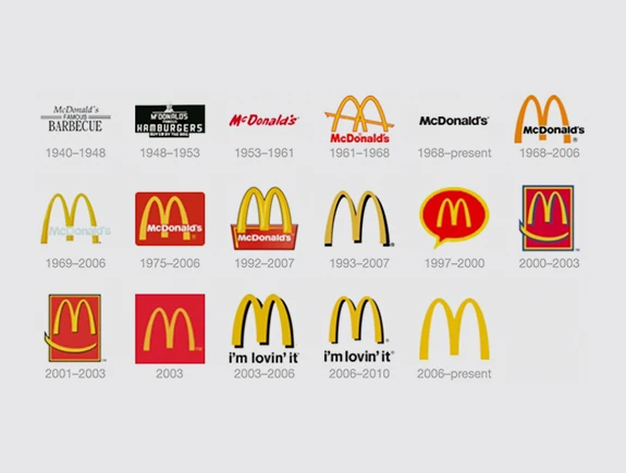
This is one of the most recognizable logos worldwide. As the fast-food restaurant chain is present in over 100 countries, the golden-yellow logo continues to bring people together around the table for food and entertainment.
As you can see, the logo initially had a descriptive character, indicating the nature of the brand. Only about 20 years after the brand’s inception, in the 1960s, we can observe the appearance of the distinctive golden arches.
The logo’s appearance changed over the decades, with red and yellow colors alternating, occasional additions of black, and a slogan accompanying the basic McDonald’s symbol. However, the essence remained the same – the letter “M” has always been and will always be the recognizable symbol of this fast-food chain.
Apple
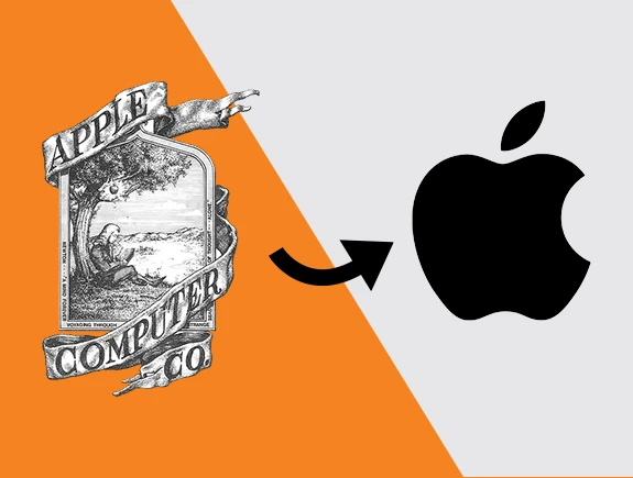
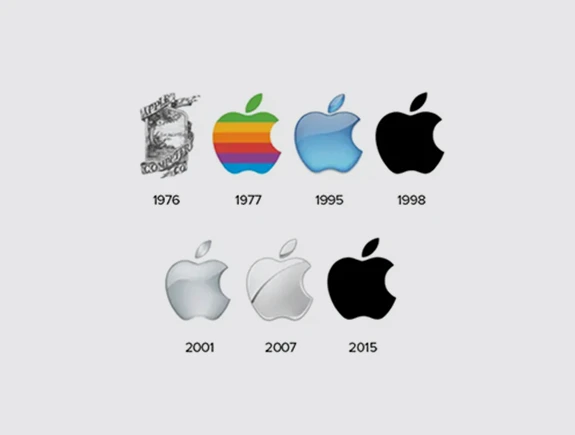
This logo has had a consistent appearance since 1977. The iconic bitten apple symbol has remained unchanged, although the colors have changed. Colors are less important when it comes to Apple because everyone recognizes the apple, while colors can change the symbol stays forever. However, the original logo of this company looked much more complex and contained more details. Details are often one of the 7 clear characteristics of bad logo design, which Apple quickly realized, leading them to a simple and iconic design that we all love today.
Starbucks
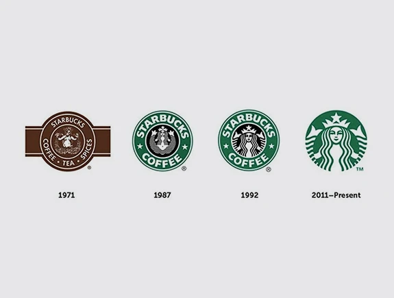
The original symbol from the 1971 logo is still present today but has become much simpler – another logo supporting our argument that simpler is better. More than half a century ago, Starbucks chose the mermaid as its symbol. The logo had an antique look, and it also mentioned what the company offered in its establishments.
The colors in the original logo were brown and white, but in the late 1980s, Starbucks finally introduced the recognizable green into its logo. The circular logo underwent several changes, and the current one contains only the recognizable mermaid in green and white, without additional brand name or product information.
Titans Love to Create Simple and Effective Logos
At the end of this historical review, prepared to highlight the importance of simple and effective logo design, we want to show you one of our works. In the example of creating a new logo for the company Organico, you can see that we adhered to simplicity, emphasizing to the client how important it is for greater brand recognition in the market. Simplicity also makes it easier for customers to remember the brand and happily return for every purchase. If you like this and other works of ours and want us to redesign your logo or create a completely new design, contact us and schedule a meeting with us.


