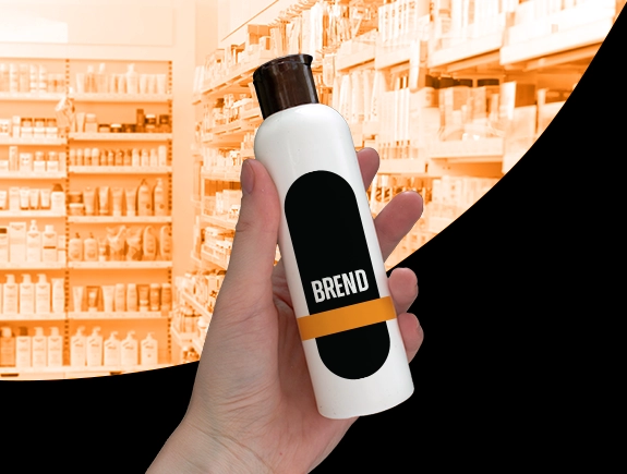
Product labels are those small stickers, tags, or wraps found on every product we see on store shelves. Most people barely notice them as they toss the product into the cart and rush to pay at the checkout. However, they play a crucial role in branding and marketing, serving as a vital element in the overall product presentation strategy.
The definition of a well-designed label states that it provides essential information, captures attention, motivates the customer to purchase the product, and conveys the brand’s identity. A label lacking these elements prominently visible at first glance may fail to generate sales or even deter customers from the product.
For every brand owner, it is crucial to understand how well-executed packaging design, of which labels are a part, impacts sales. This should be a priority without compromise because the label is your “salesperson” on the shelf. With just a few seconds to capture a customer’s attention while they choose a product from the shelf, it is crucial for the label to be eye-catching and contain important information.
Let’s now go through the five essential steps leading to the creation of the perfect product label. When our designers create a label for a product, they follow these steps.
Step 1: Understanding the goals and purpose the label should achieve
Before diving into the design itself, we discuss with the client what the label should achieve with the customer. We explain that every label should fulfill several key goals:
- Capturing attention: The label must stand out among others on the shelf, using colors, shapes, fonts, and other graphic elements to catch the customer’s eye.
- Communicating crucial information: The label must emphasize essential details such as the product name, key features, ingredients, size, and benefits.
- Reflecting brand identity: The label must align with the overall brand style and messaging, serving as a fundamental link connecting the customer with the brand.
- Motivating the customer to purchase the product: A perfect label triggers an emotional response to the Call to Action (CTA), leading the customer to buy the product.
Knowing all this, the designer can proceed to create a label that is not only visually appealing but also functions to sell the product.
Step 2: Rules and regulations regarding product labeling
To comply with regulations and ensure product safety standards, it’s crucial to stick to specific labeling requirements. These requirements may vary depending on the type of product, the manufacturing and selling locations, and other factors. Once researched, these requirements are communicated to the designer, who incorporates them into the label design.
Step 3: Choosing the format, shape, and material of the label
There are numerous options when it comes to the appearance of the label. Below are the most crucial aspects to consider:
Label format:
- Sticker: Printed label directly attached to the product packaging.
- Hangtag: Tag hung on a string or attached to the packaging.
- Wrap label: Cardboard or transparent wrap around the entire or part of the product.
- Shrink sleeve: Plastic sleeve tightened around the container using heat.
- Adhesive label: Printed paper label attached with adhesive, commonly used for bottles.
Label shape:
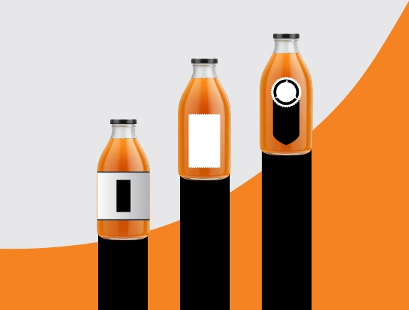
- Rectangle: The most common label shape.
- Circle: Fun and eye-catching shape.
- Oval: Classic and elegant.
- Square: Retro and trendy style.
Label material:
- Paper: Classic and cost-effective material.
- Plastic: Durable and waterproof, but more expensive.
- Transparent film: Displays product details.
- Foil: Reflective material for a luxurious look.
Step 4: Arranging attention-grabbing elements
Now we’ve reached the fun part that our designers enjoy the most. It’s time to bring all the elements together and design a label that customers will easily notice. Here are a few things to consider at this stage:
Choosing a color palette:
- Limiting to 2-3 colors at most.
- Ensuring colors align with the brand palette.
- Considering colors that evoke the desired mood – green and earthy tones for organic products, bright colors for playful brands, etc.
- Black, white, and metallic always look elegant, and that’s a fact.
Strategically selecting graphic elements:
- Illustrations and mascots can enhance the brand.
- Photographs showcase the actual product.
- Icons help customers quickly identify key ingredients or product features.
- Edge shapes and lines add a finishing touch.
Carefully choosing fonts
- Fonts convey the brand’s personality – playful, elegant, vintage, etc.
- Sans-serif fonts like Helvetica work well for a clean, modern design.
- Use font variations (bold, italic, uppercase) for contrast.
- Limit to 1-2 font groups at most.
Establishing a clear visual hierarchy
- Brand and product names should stand out.
- Use the right font size, color, and layout to emphasize important information.
- Meticulously arranging elements in the visual space.
Step 5: Compelling text to convince the customer to choose the product
Words are as crucial as the visuals our designers create. Here are the essential rules we follow when deciding what to put on the label:
Captivate attention with a catchy slogan
- Keeping it short, memorable, and reflective of the brand’s essence.
- Adding creativity or humor to make it stand out.
- Highlighting a unique selling point or evoking an emotional response.
- Ensuring alignment with the brand tone and resonance with the target audience.
- Testing its impact to ensure it grabs attention and leaves a lasting impression.
Final step – Testing and sending
The job isn’t complete when the label design is done. Testing the solution and seeing how it resonates with customers is essential. First, we find unbiased consumers to review the label and provide their opinions. They look for any inconsistencies or issues.
In addition to this test, we ensure that all letters and punctuation marks are in their correct places. We examine colors to ensure consistency throughout, and we double-check all letters and numbers related to certification.
If parts of the text were translated, we review the translation once more. Furthermore, we verify that the nutritional table (if applicable) is relevant and accurate to inform customers about what they are purchasing.
Now that everything is ready, we send it to the client for their feedback. It’s rare not to have any revisions from clients, but it’s crucial to know how to give feedback to the designer during this process. The next solution you receive should meet your needs and align with your brand.
In conclusion, if you need a label, packaging, logo, catalog design, etc., Titans are here for you. Our design team will create the perfect label for your product, pleasing customers and serving as an excellent addition to your company’s visual identity and brand.


