December is an ideal time for overviewing trends, especially the ones that will be popular and dominant in the upcoming year related to web design and UI (user interface). Our team likes to follow trends, and fit them in the website design of our clients because we aim to help them present their brand in the most appropriate and modern manner. let’s take a look at the trends, styles, and techniques, that became popular at the very end of this year and will keep the leadership in web design and UI trends in 2022.
Before we start the topic, we would like to overview our work in the current year, and we would like to recommend some of the most popular texts about web design we wrote about in previous months. The importance of understanding responsive web design is a useful text and readers of our blog posts recognized it. When it comes to business owners, they were interested in the real cost of web development.
Let’s start with trends for 2022.
Fun and optimistic design
We believe everyone would agree we need just a bit more optimism after this unpredictable and hard year. Bright colors, fun shapes, and a few emojis can do a lot for a brand and present its optimistic spirit. thanks to this trend (that is easy to apply to e-commerce sites, for example) our designers will support spreading positive vibrations and optimism of your brand.
Nothing boosts optimism more than smiling faces, so website photos should follow that spirit – smiling people spread positive energy and inspire site visitors. This trend is supported by interesting fonts, but it is recommended to pay attention to colors and pick only the positive ones that will make people smile.
Black & white color palette
For the clients who find the previously mentioned trend too snazzy, we can recommend the black & white color trend in 2022. If you exclude the colors, everything will become cleaner and the focus will be on the design itself. When you use only black & white, creativity is almost endless, and results can be impressive.
Minimalism rules for a few years, so it is not surprising this trend will continue to be popular in the next year too. A key to success that enables black and white to look good on all screens and bring a modern and clean look to the site is actually in using the proper effects and techniques. Our designers are already preparing to apply this trend on some of the sites next year.
Aesthetics of shared screen
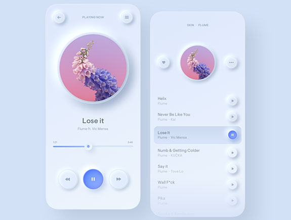
This trend is not new because it appeared a few years ago. At the time we spotted it for the first time, it was oriented to enhancing the user experience and easier usage of functionalities on the site, while today, it is just a design trend. Visuals, using the aesthetics of a shared screen can contain the horizontally or vertically shared screen, and these parts can have the same or different functionalities.
the best option is when design solutions can offer a strong visual experience for visitors but also various menu functionalities redirecting to the rest of the website content. We like this visual solution because it connects simplicity, and offers the possibility to express ourselves in a creative way.
Home page without photos or visuals
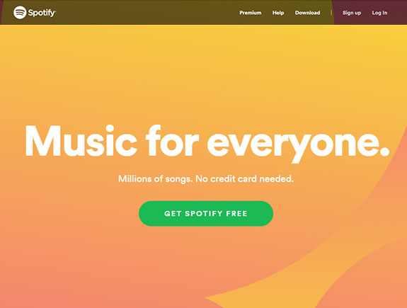
This website design is ideal for clients who are not fond of displaying any photos. Photos don’t have to be in the focus, so if you decide to use this type of design, you will be trendy anyway. What is so specific for this type of design? First of all, creativity, because you can use different techniques and combinations of elements to make the first page interesting. Oversized handwriting, animations, interactive elements, can only be part of ideas of how to populate the page without any photo.
Mega footers
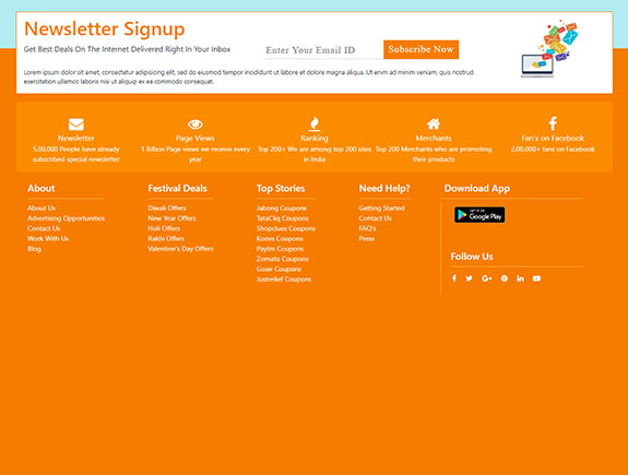
Nobody could predict the mega footers, containing lots of information will become one of the main trends in 2022. They are presented as a must-have design element for next year. what is the reason for their sudden popularity? Probably because they are practical, as they are ideal for placing the shortcuts, important for site visitors.
Mega footers can be creative elements on the site. The way information and links will group depends on the current inspiration of our copywriter, but also on our clients’ needs. besides a few columns where the products are usually grouped, etc., mega footers can contain a contact form with all the most important data or a newsletter subscription box.
New Year is approaching and the trend report is ready – we can’t wait to start new projects
If we are to judge based on trend reports, then we are looking forward to another exciting and innovative year filled with new website development projects where we can express and move the limits of our creativity. Inspiration can be found literally everywhere. According to our opinion, the trends we have chosen are only a small part of what will be the most popular in the upcoming year.
If you decide to redesign the site or design it from the scratch, we are willing to meet your ideas, and will gladly recommend some of these trends that fit your needs.
Before the first meeting with our team, it would be great if you read our blog post about the 5 questions for our clients before we start with the website development, but also the text about the 5 benefits of working with a full-service marketing agency, because in those texts, you will be able to find all the most important information about the website development process, and all the steps of cooperating with an agency.
If this is your first time working with a marketing agency, we are sure it will be valuable to you to learn about the way the agencies and clients can communicate well. Besides, you should inform on 5 types of clients the marketing agencies work with and avoid some of the most common mistakes the clients make.
Finally, if you like our report on top trends for web design and UI, feel free to share our blog post with your colleagues and subscribe to our newsletter because you can expect many interesting and useful texts.
