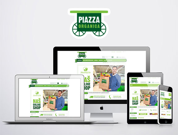
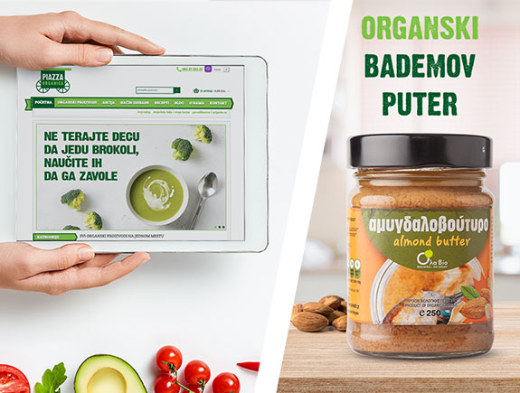
Organic food, just a click away from you, is a webshop of our client Piazza Organica. This is one of the projects we have been working on for years, and we have tailored design, functionality according to our client’s needs from the very beginning. This opportunity gave us the space to studiously work on a website development related to all the most important parameters. In this blog post, we will share our story about developing and improving one of the most popular and most visited online shops for organic food in Serbia.
About the client’s needs and requirements
Piazza Organica is a shop for organic food, and it thrills the residents of Vracar and visitors of the Kalenic market with its wide range of products, always fresh fruits, veggies, eggs, and other health products for many years. Along with creating a retail network, they decided to present their products to Internet users as well.
Stats revealed the buyers didn’t come from Belgrade only, as the client already assumed, they came from all parts of Serbia. For this reason, the client decided to focus all marketing investments on the online shop and home delivery of organic food.
At that point, we suggested creating a webshop so customers can make purchases easily.
Goals and target audience
The goal we strived to achieve was to make clear categories for product search, tailored to clients’ various wishes and needs. Besides, we tried to simplify the purchase process and present it in just a few steps to customers.
We split the target audience into several categories, young people, successful people, those who take care of their health, and understand the value of organic food. Besides these categories, we targeted mums especially, as they were immensely interested in the highest quality fruits and veggies. In the end, we targeted people with health problems in order to help them improve their health with healthy food and habits.
And now, the tasks…
Tasks – to achieve the goals we set for our team, we split the overall process into several tasks:
- Creating webshop categories and functionalities – we took some time to thoroughly think about criteria for splitting the products into categories and subcategories. This turned out to be an easy task for our team. Certainly, creating and adding the categories is a continuous process as each webshop is a constantly changing system.
There were 20 categories in total, and we thought it is quite possible for everyone to find something for themselves. First, we split products into categories they belong to (like organic sweets, organic eggs, organic meat, etc.) then based on the type of nutrition (for example, gluten-free food). So vegans, raw food fans, those who eat gluten-free and sugar-free products got their own categories on the site they can visit and make a fast purchase of products dedicated to them only.
The last category, based on our opinion, the most popular one, is SPECIAL SALES, and we created this one to be constantly active, current, and searchable.
- Product description and other most important info – this process is still in progress and each new product gets its description, detailed description of ingredients, all variables, and if needed instructions on how to use it (as with cosmetic products). Our team considered this task very significant so we dedicated our full attention to it. The team researched fruits and veggies that were available at the Piazza Organica webshop and add interesting facts about each item, such as their impact on our body and overall health.
- Our third task was to create the most efficient way for repurchasing. Nobody likes a long online purchase as all this info customers are required to type can be tiresome to them. So we did our best to simplify this process.
The starting point is registration, where we ask for basic info from customers so they can create the accounts. Next, they would search the webshop and add the items to the basket. They would have to check one more time if they chose all products they wanted. After this, the customer would add info such as name, address, type of delivery. Finally, they would choose the preferred payment method (in this case it’s cash on delivery) and finish the internet purchase.
- Visuals attracting the attention – this task required creativity so we asked designers to create a solution that would follow the company’s visual identity and corporate colors. You’ve probably noticed the green color is dominant and the chosen fonts are used in all visuals created for the blog, infographics, and similar site content.
We sticked to the rule “the simplest the better” so we placed on the homepage the most popular products and various search categories besides the visuals on special sales, etc.
In our opinion, we covered the most requirements and trends related to modern, functional, and well-visited webshops. We wrote about it in our previous blog post 5 tips to create an awesome webshop.
Additional ways to improve the content
For consumers to realize the advantages of online shopping, we wrote a blog post on this topic on Piazza Organica blog page. This way we tried to help potential consumers to make decisions on shopping online and to think about saving their own time.
Besides, we were developing the blog section on the site for more than 6 months, so to get more site visitors. Topics were carefully chosen in accordance with the needs of the target audience, so we wrote texts about raw food, gluten-free food, etc. For stats fans, we added a few infographics about healthy eating habits, fruits, and veggies.
If any of the customers have ever asked themselves: Why should I choose this webshop? We gave them not one but five answers to this question in a blog post you can find on Piazza Organica site.
Finally, how can we talk about food without mentioning recipes? They are one of the crucial parts of the site as they draw lots of attention and site visits.
Titan solutions for Piazza Organica
We have come to the end of this success story about an organic food online shop. It is time to share the final web design solutions of the Piazza Organica site, and we would like you to share this text with anyone who could find it valuable.


 Logo and brand are not the same things