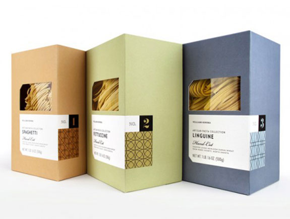
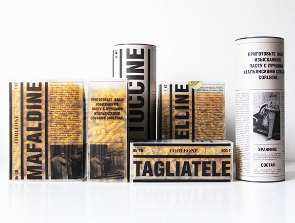
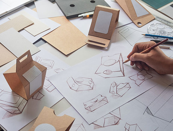
(1st part)
Product packaging makes this world much cleaner and organized. Whether it’s about your favorite chocolate, organic quinoa beer, or body cream – all these products would not be so recognized or well positioned on the market if their packaging is not as attractive as it is. Let’s take a look at the phases of the packaging design process.
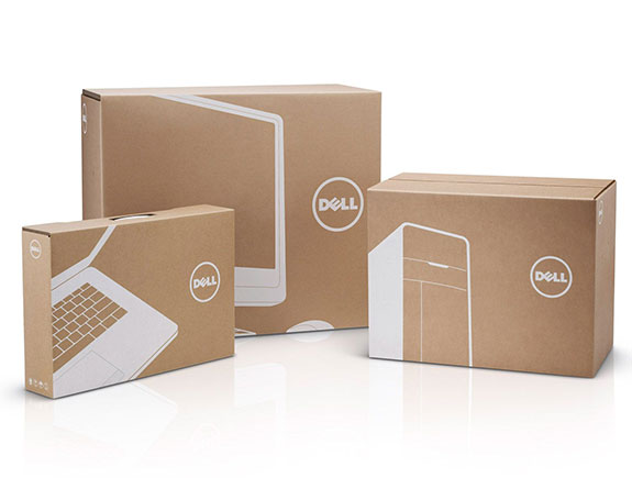
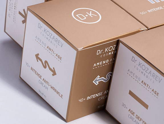
Design of external packaging includes choosing shapes, materials, graphic elements, colors, and fonts.
The packaging should be practical and much more than that. It should tell a whole story about the smell, taste, sound and stir all senses when the consumer takes the product into hands.
All these details can help consumers understand the product functionality, purpose, and answer all other questions that will impact their final decision – the one about purchasing products.
Before we dive into the creative process, we would like to point out a few important questions we usually ask our clients in the very process of gathering info.
A phase before designing starts
There are three key questions you should answer before starting a creative process:
- What is the product? This should be easy but that’s not always the way it is. What should you sell? What size is it? What material is it made of? Does it have a solid or delicate structure? Answers to these questions help us discover the type of material we should choose. If the product is fragile you should pay additional attention to material choice.
- Who buys the product? Is it used by females or males, or both genders equally? Is it meant for adults or kids? Is it dedicated to a target group interested in protecting the environment? Is the product meant for those with higher or lower salaries? It is essential to think about an ideal consumer before we start working on a design. One of the examples is products for the older population that requires bigger letters on packages for practical reasons.
- How do consumers buy the product? In the supermarket, little local shop, online? Answers to all these questions provide a clear direction. If the products are packed for export, the transport boxes should enable safe transport. Followup text should be in English or any other foreign language. Finally, the package should evoke a feeling of happiness.
Do you have answers to all these questions? Then it’s time for the next step – gathering additional info.
Tell us just one more thing…
Sometimes the product has already been established on the market. This implies the proper presentation but simultaneously to have a dash of individuality. If the new look should fit an already existing brand aesthetics, it is essential to discover the following info:
- Colors – corporate colors or brand colors from books of graphic standards.
- Fonts – you can also find them in a book of graphic standards and we need a precise interpretation about the usage in different situations.
Logo – one of the priorities that should find its place on the packaging. It is recommended to have them in a vector format.
Information that should be placed on the packaging
Each product or product group should have certain info on the packaging, that should be clearly visible to consumers. The content of this info could vary depending on the product, market, market legislations, and niche.
This is the crucial information:
- Copy – it could be anything, a title, or a call to action
- Photos and visuals – they should be prepared before the designing process and could be an excellent addition to other elements.
- Labels – there are certain labels that must be placed on the package due to certain legislation (for example nutritional values of products) but next to them should be placed labels of certain associations of professionals, geo origin, or its characteristics (organic food, products from Serbia)
- Time-limited content on the package – this should be prepared too because it will be necessary during the printing process. This type of content is mostly related to the production date or expiry date.
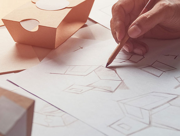
In this phase, before we start packaging design in some of the programs used for designing, a bit of a priori research is needed.
Style choice: What do we like or don’t like
Researching could cover anything, from searching online inspirations on Pinterest, circling shops, making photos of already existing packaging designs, collecting chocolate samples you liked, etc.
But we should always keep in mind the chosen design should meet the client’s preferences.
Though some designers dedicate more time to unique packaging design to win prestigious awards at various festivals and gatherings, the fact is the final word comes from consumers. More time for rewards, less time for functionality – this is not the best possible concept so we are striving to pay equal attention to both.
Budget for packaging design
It is of crucial importance to explain to our clients the way we shape the cost and the possibility of additional costs.
We can classify the budget for packaging design into two categories:
- One-time costs
- Costs based on individual products
One-time costs cover the original packaging design, everything needed for the offset print, and these are mostly one-time expenses unless the client doesn’t want to change the design after some time.
Costs based on individual products are related to material and fees for employees. Each box has its cost, so you should add the cost for paper, and ribbon for tying the packaging. Sometimes it may happen the brand wants a personalization of the product. In that case, it is needed to change the names on stickers (which is an additional cost too).
Certainly, the clients want to have a cost breakdown before they start working on the project. It is important to provide a cost breakdown to clients. Keep in mind cheaper never means better because investing in a good and quality design is priceless.
The next blog post will be dedicated to the creative phase of the overall process of packaging design for specific products. Till then, feel free to share this text with someone who might find it valuable.
