Project Brief
Industry: Meat industry – production of fresh meat and meat products
Client: Nedeljkovic
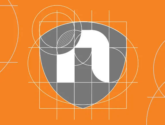
Our agency’s service: logotype redesign and creation of a book of graphic standards
Goal: Creation of a new logo that will be recognizable, modern and original. Also, establishing clear principles and high standards of corporate identity.
About the client
Slaughterhouse and meat processing company Nedeljkovic is a family company, founded in 1989. Since then, it has been growing and developing its production capacities and improving the quality of meat and meat products. This company produces fresh meat of different types (lamb, beef, veal, pork, mutton, and pork) and more than 50 types of meat products of the highest quality.
Since they founded the company, more than 30 years ago, the Nedeljkovic company has been constantly expanding its retail network and increasing the number of countries to which they export its products. Currently, the company has 16 of its own retail stores and exports its products to over 10 countries. They plan to double the number of their stores and further expand the sale of meat products.
In accordance with the tendency of growth and development of the company, it was time to change the visual identity. The change comes at a time when the company wants to position itself even more firmly on the market, to introduce itself to new customers, but also to surprise old ones with a new logotype and corporate identity.
A challenge that was put before our designers
In the brief, the client asked our designers to create a new logotype that should be clearer and different from the old one, but at the same time unique and recognizable among customers. In short – everything the old one was not. The second part of the task was the creation of a book of graphic standards, to clearly and precisely define the most important principles of the company’s new corporate identity.
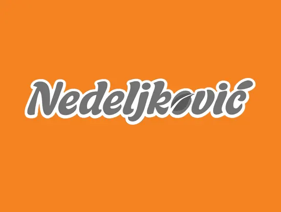
When it comes to the old logo, it was too generic, didn’t stand out, and wasn’t distinctive enough. In addition, its applicability and readability on different media, such as billboards and paper, but also websites and web banners, was not at a satisfactory level.
But that’s not the end, the old logo looked a lot like the competitor’s logo – the typography was very similar, and so were the colors, so it was possible for customers to confuse the two brands. Let’s conclude the analysis of the old logo by saying that the typography was outdated and that a redesign was really urgently needed.
The solution
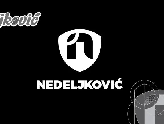
In accordance with the client’s needs, its target group, and the company’s goals to further climb the ladder of successful companies in the meat industry, we created a new logo. This logo has its own story, speaks directly to customers, communicates with them, and leaves an impression. We are proud of this redesign because we know that both the client and their customers got a logo that will be easy to remember and based on which they will easily find products in the store. And what else did we achieve by creating a new logo for the Nedeljkovic meat industry?
- Our solutions for the logotype and other elements, which will be applied on different media, are simple, refined, without unnecessary details, and can be applied on all surfaces and in all formats,
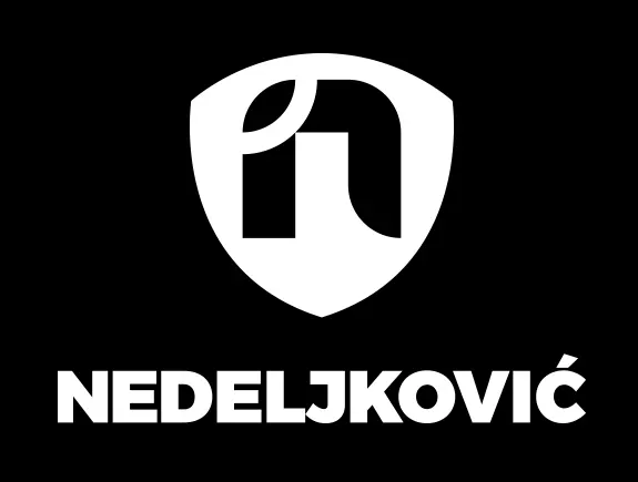
- We decided on a typographic solution with an icon – which as a whole will represent the company in a new light,
- We emphasized the red color as the basic corporate color, for which Nedeljkovic is known, and we added elements in white and green to it, to create a balance,
- The green element of the leaf, in this case, represents the constant growth of the company (which was important for us to emphasize),
- The white letter N was chosen to represent the first letter of the company name and to be a contrast that stands out against the red background,
- The red shield is designed as a sign of safety and quality of the highest, world level,
- We decided to write the company name (in those cases where it will also be displayed) in a simple black font so the new logo still remains in the forefront.
The result
The Nedeljkovic company got a modern and recognizable visual identity that will represent them properly among the target group. The final graphic solutions, made by our designers, are already well recognized and accepted by customers. Customers now clearly recognize them, without fear of being confused with another competing company. New solutions can already be seen on the website, social networks, branded stores, etc.
Customer impressions
We got a defined, solid, and modern design for the next chapter of our company’s development. The design team easily and quickly understood our needs and proposed solutions that fit our goals, and the result, in the end, is a 21st-century visual identity. We are also very satisfied with the book of graphic standards because we finally have everything related to the branding of our business in one place.
