Web design and social media trends keep changing this year faster than we can apply these changes. Coronavirus pandemic changed popular trends, next in a post-lockdown phase, the third generation of trends started. At what point did you stop counting?
It is not easy to remember and follow trends, but we are striving to reach authenticity in web design. Though, it is important to follow the direction of the industry in order to present the most interesting trends to clients.
This rule especially applies to social media and web design because internet trends change faster than logo design and packaging design trends. What does it depend on? First of all, it depends on the interest of site users, and social media profiles constantly searching for innovations, enjoying experimenting with new filters, fonts and stickers. All these elements found their place on websites too where animation and interaction with site visitors take an increasingly important place.
In the last few years, one rule became dominant: in the initial phase, you experiment on social media, especially on stories and other short formats, that previously used to last up to 24 hours. Now you can save them – and only then, trends that proved to be successful go further to the websites, etc.
We will try to sum up the upcoming trends for online design.
1. Emphasizing and underlining the text
The first popular trend for this summer comes from social media (Instagram). The creative team from this company designed new fonts for IG story.
According to unwritten rules in website design, it is recommended to use the simplest fonts for texts. Bold fonts are acceptable, italics are OK to be used sometimes while underlining is rarely used.
Finally, we come to the new trend and its use on the web. How does it work? This trend goes against the established rules because it uses underlining and emphasizes certain parts to draw attention to keywords. This way it manages to attract more attention and keep the attention of consumers on a specific word.
What is needed to make this trend usable are color contrasts and to fit design style into underlined and emphasized text.
Thanks to a very clear idea, it manages to attract a large number of designers and be often used. We are aware of the fact keywords are the ones to attract the attention of the visitors so we need to additionally emphasize them to present the most crucial information to consumers or direct them on how to react to call-to-action.
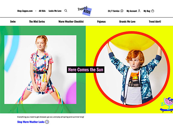
This is the example of US clothes for kids brand, and we can notice the way they use a black background and letters in different colors so they can emphasize the key textual element. This element looks similar to a clickable button, and its purpose is to point out the site segment website visitors should click on. It is significant to introduce all interactive elements to site visitors, as well as their functionalities. It seems the Zappos online shop successfully deals with it.
2. Visible geometry
Geometry shapes are popular in web design, and they have a great impact on site aesthetics.
Geometric elements fit great with illustrations, photos, texts, whether placed in the background or at the central part of the visual. They also fit well with other elements of various shapes and samples.
The approach to the application of these elements should be carefully conducted because it might look very strange if we place several triangles or squares on the website without taking care of the meaning and connection with other parts of the site. These elements require more space and a little bit of thinking.
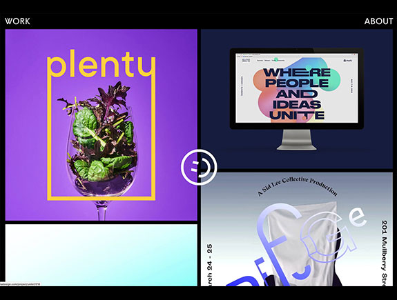
This is a great example of the usage of geometric shapes used in the so-called modular geed in the works of a well-known American designer. This is one of the most common but at the same time easiest ways to use geometry for emphasizing certain parts of visuals. In this example, the glass with herbs framed in a rectangular shape and a text, with an addition of another geometric shape – a circle with a smiley (created as a fusion of rectangle and half circle) that remains on the screen and during the scrolling which makes the site even more interesting.
3. Shades and gradients
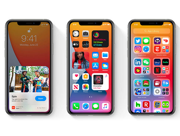
Designers increasingly use shading and the depth of space in their visuals. iOS started this trend, by representing the new update with icons with subtle shades and gradients in design. We believe this trend will become popular, and many companies ad individuals will follow it. Yet, they are not the only ones who liked the combination of these two techniques.
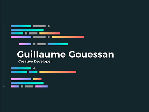
A French developer, Guillauma, and his works are great examples of the usage of gradients and the subtle change of colors. You can check his website and to find inspiration.
Our opinion on these trends
We are following, observing, and adopting trends we like the most.
The fact is that famous brands and designers, cooperating with them, due to the large public attention and space they take – have the power to dictate and establish new trends. Apple is a leading trendsetter in its niche, and no matter how much others try, nobody can beat them in the top-notch design experience they offer to its users.
It seems gradients and shading will be popular for a while, and gladly used, especially in designing applications.
On the other hand, a trend of emphasizing and underlining is popular on Instagram, and users from Serbia, because it can provide great results when certain educational content is being shared where underlining and marking keywords create a contrast needed to make a text as readable as possible.
Geometry will find its place not only on websites but also in designing Instagram visuals for stories because it gives an interesting frame of different shapes in a text or any other visual element. Imagine our Eurocrem in such combination…
Till our next post on popular trends or any other topic from the graphic design field, if you need a logo design, creating a visual identity, or anything else from our portfolio, book a meeting with our designers and find the inspiration on our blog page.
