It seems everyone is talking about this topic and you will probably say: there is nothing new to add to this story…but we want to convince you to the opposite because our impression is that this topic is not covered in a proper way as the basics of logo design and its elements are somehow forgotten.
If the basics are not set up in a proper way and if doesn’t work as it should, everything else done afterward will not bring expected results. What is the starting point? The idea, of course, and direction we want to further develop the idea.
One of the reasons you should dedicate to the idea and direction of the logo design development is the time and money invested into a logo design that could not be brought back unless the direction was wrong. So, if you take enough time, if the idea is clear and the vision for the final positive outcome exists, then the logo will “hit” the target audience properly, i.e., straight to the point without wrong shots around the target itself.
Once you dedicate to the logo and brand, keep in mind you actually dedicated yourself to the business.
Nowadays, it is much easier to find a great designer and create the initial idea. Based on this idea, a designer will create a logo. Inspiration is all around us (try to check popular platforms like Pinterest, Behance, etc.). The next step in this process is an initial meeting with a designer where you will present a few ideas and the general direction. Of course, if you haven’t researched the platforms we mentioned, you can rely on professionals that could suggest a few logo versions. You have probably seen some of our works and we are sure they caught your attention.
Let’s go back to the basics.
What is the purpose of a logo?
To understand the meaning of a good, great, creative logo, first of all, we have to understand its purpose. The logo is in fact a sorting tool. With its help, we could separate one product from another and manufacturer which is even more important. Each company needs to find a way to stand out from the competition, which they do via messages they send, unique packaging design, or when it comes to services, a recognizable way of presenting them. If logos or brands wouldn’t exist, it would be difficult to remember who do we buy the products from.
Imagine a world where all restaurants or supermarkets have only one sign that defines them. Then we should pick a specific restaurant, based on its functionality or based on how it fits into your system of values. It is certainly an important element for making decisions but it cannot be the only one.
Luckily, logo and branding are there so we don’t have to live in an impersonal world of the same signs that mean nothing but mean everything at the same time. A logo is a unique form for communicating important messages – who produces a ceratin product or offers a certain service. We will try to explain our thought in the next example.
Let’s take a can of Coca-Cola or Pepsi as an example. Both products offer more or less the same service to the customers – they contain almost the identical amount of sugar and liquid, but buyers know very well to distinguish these products based on their taste (based on the studies).
Where is the problem in this case? How to create a recognizable branding for these so similar products?
Branding becomes even more important as in this case, the individual value of brands is the same. In combination with the information that buyers make their decisions on an emotional level, based on the exact scheme – we come to the solution, that implies building a strong brand with a recognizable visual identity and logo as its most essential element. When designers connect a visually stimulative element, such as a logo, with the brand story behind it – then we got the brands each person on this planet can recognize.
Features
Feature #1 – best logos can be sketched based on a memory
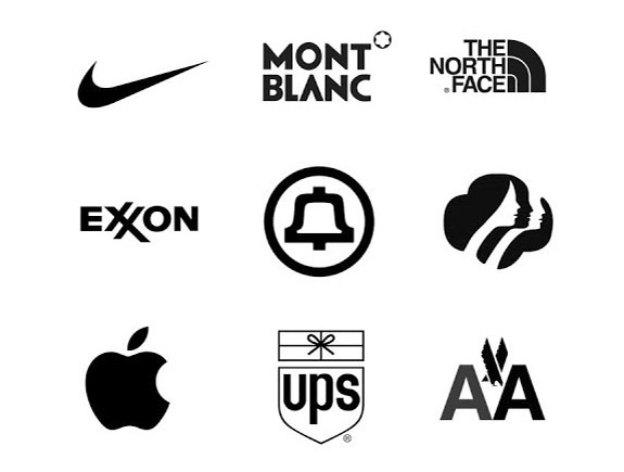
If anyone can notice, remember or draw a logo without too much effort, then it means that logo is great. Let’s take famous examples: Nike, Adidas, MacDonalds. All of them are easy to remember and draw so even a child can draw them. This is why they are so convenient for long-term memory.
This type of test is mandatory and should be done during the meeting with a client, so a designer can realize if the owner or a general manager remembers the logo. Also, this is the most difficult test as it is not easy to do something so easy yet ingenious and memorable.
Feature #2 – a logo should have a clear structure
The structure is one of the most vital features nobody speaks much about. Try to imagine a graphic form as a certain structure. Does it look firm? Is it symmetric and balanced? The human eye is used to symmetry, organized symbols, order, and stability.
Also, the same is expected from fonts. This is the reason Comic Sans is one of the least popular fonts on this planet. Structure equals excellence. It seems we all tend to achieve excellence and that is especially the case with big companies and their business.
Keep in mind though people like modern forms and fonts, they always strive to discover something fresh, unique but unrepeatable. In that case, the logo should be both structured and innovative. Wondering how to achieve that? Exactly, at this moment you get into a challenge and the answer would be to have a lot of patience, planning, drawing to get to the unique solution.
Feature #3 – the company owner should like the logo
You’re reading this and thinking: why should a company owner like the logo? Why is that needed? Don’t we make it according to the target group?
Company owners are usually fond of their logos as it’s the first they think about when thinking about the company, but this is also the first concrete proof of the company’s existence and it reminds the owner of all the effort invested in the company and its success on the market.
This feature is the first obstacle as well in logo design as it might become a trap. Design should not rely on anyone’s personal taste, not even your own. That is the purpose of brief, to give us clear directions. Though, we cannot deny the fact the company owner should be happy with the final logo too as that logo will represent the company, be used for promo materials, etc.
Every designer should have the ability for suggestions and the client’s taste as on the other hand, the client, should respect a designer and the time he/she spent. The process of creating a logo should be based on communication, understanding, listening, and suggestions for enhancements.
Let’s get back to the very beginning of this text – when does it matter if a company owner is satisfied with a design solution? Usually in startups when an owner is a CEO too, which could be the case in small businesses as well. In the case of corporations, the CEO is often not involved in this matter because the marketing and communication departments deal with it. Nevertheless, at the end of the day, all of them stand behind the company’s logo that represents their company.
All you need is “YES” and one logo only
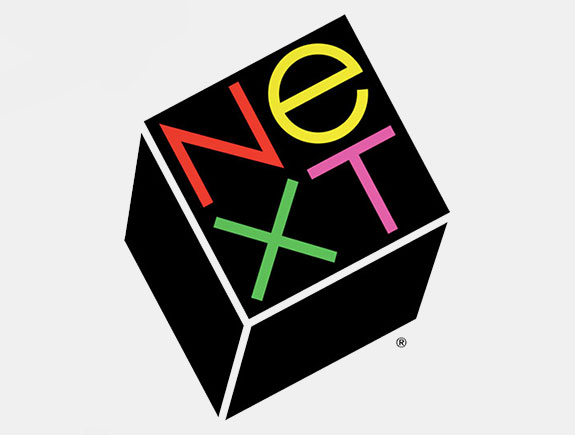
Have you ever heard of Paul Rand, who earned $250 000 in 1986,. When he designed a logo for Steve Job’s computer company “Next”? He is one of the most famous designers who became a legend during his career.
This number becomes more impressive when you take into account the fact that Paul gave only one option to Steve. He made a book of 100 pages with only one logo suggestion. The book was a guide through the logo concept, its step-by-step creation starting with the initial concept to the final solution.
No wonder Steve Jobs accepted such a unique concept, considering the fact he was quite perceptive and had a great talent to judge people and their abilities. These are the characteristics of the greatest business leaders.
The point of this story is to trust the talent, hard work and feeling designers have for a good logo. It is important to find the right designer, the one who will understand your needs and the one whose suggestions you can understand.
If you find this text interesting – share it with your friend and colleagues.
