When a customer picks specific products, he-she does it based on many criteria, but it is the packaging that leaves the first and strongest impression. Packaging establishes the first contact so the attention paid to current trends related to packaging is not surprising.
The main tendency for many years, related to the choice of packaging material, is experimenting with new materials that will eventually replace plastic and encourage the sustainability concept of packaging. Hence, algae, mushrooms, and other biodegradable organisms are increasingly used instead of plastic.
To conclude, it is not just the look, practicality, functionality of the packaging, but also the material that draws attention. These are all points important for consumers as they pay attention to all those details, before making a final decision about the purchase of a specific product.
This blog post is dedicated to trends that definitely drew our attention. We also promise one more blog post about a revision of trends we used for packaging design in 2020.
1.The minimalist approach still dominates
Though this trend is dominant for a few years, it doesn’t seem probable something will change soon regarding that topic. More and more brands turn to minimalist packaging, and this impacts the overall visual identity.
Following this trend, designers remove redundant elements and leave only the essential ones.
When it comes to packaging design, this trend has greatly helped to emphasize the most relevant elements, presenting the core of a design – typography, and colors. As a result, packages get a simple and clean design that doesn’t distract attention from a product.
Many designers stick to the rule less is more when creating packaging design. This trend is especially popular in the organic food industry, home products, and most known Scandinavian fashion brands.
A MESSAGE for 2020. Clean design, without redundant elements.
2.Transparent package
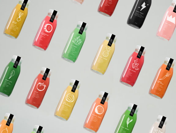
Nowadays, customers are not only interested in reading the labels and general product info, but they are also interested in the look of the product. They want an exclusive peek into the product below the label, so they can instantly make a decision whether they want to buy that product or not.
This trend exists thanks to the fashion industry, where a transparent design of bags was one of the main trends last season. Transparency has become a popular trend, as it saves time and money and also allows the customer to have an insight into the product looks, to see if it’s fresh (if the product is food).
In the food production and processing industry, juices, and similar products, you can see transparent packages. This type of packaging is ideal for products packed in bottles, PET packaging, transparent jars, or transparent bags. At the next stage, designers choose a color that emphasizes the freshness of the product in the best possible way and additionally attracts customers.
A MESSAGE for 2020. Transparent so to be seen.
3.Gold print and metallic effect
This year designers are up to experimenting more with metallic shades and overlays. These effects give a different feel to the product, a bit of luxury, and the premium quality of the product. Metallic, gold pink, classic gold, can bring the whole composition to a higher level, that will evoke a wow effect on consumers, whether we want to admit it or not…we are all fond of snazzy things or if the finishing effect is matte, this will definitely draw more attention than pastel colors.
The increasing trend is the usage of the so-called royal colors. These packages are something we keep to at least put some precious little things inside.
A MESSAGE FOR 2020. Luxury is available to anyone
4.Fluid and geometric shapes
These shapes were popular before too but in 2020. they were used to attract attention with a design that has modern, different yet clear lines.
By combining a few geometric elements, like circles, triangles, or simple lines, in different colors, the final result is an oversized and multi-layered effect, appealing to our eye, a bit hypnotizing.
Asymmetry, besides geometry, has become popular too so it is not a rarity to see a package with asymmetric elements, that may not be appealing to those who like order and symmetry, but they draw attention for sure. It is significant to find a unique way to draw attention and this is the trend that undoubtedly achieves it.
A MESSAGE for 2020. More is more.
5.Striking typography
This is one of the leading graphic design trends and has become very popular in packaging design.
For building a brand identity, attracting attention (again) and leaving a strong impression on consumers is a trend that enables the so-called “all eyes on me” effect.
If a designer decides not to put the focus on the product ingredients or appearance, then all caps are a great way to replace the images with something else. So to express the artistic and creative potential in a different way, then letters are the only right and probably the best way to reach consumers.
A MESSAGE for 2020. Letters speak more than images.
These are only the top 5 trends, that we have selected, but we think they are mutually different enough so everyone can find something interesting accordion to their taste. The target audience we addressed with package design is diverse and the most important approach nowadays is to locate the narrow niche when creating a design.
We will do our best to follow trends but somehow we are under the impression typography and minimalism will be dominant in our work, though we look forward to challenges like metallic effects.
Feel free to share our blog post with your colleagues and let us know about your favorite trends in 2020.


