Website is your Digital Billboard
The website could be defined as a digital billboard as it is the very first and most important impression and contact with the website visitors.
Design trends are inevitably changing, they should be followed and accepted as ideal design solutions but not blindly, without any compromise, or strategy.
The priorities in reaching the effective design in general:
- Minimalist approach
- Easy and intuitive navigation
- Website speed (partially depends on a design)
- Consistency
- Responsive version for mobile and iPad devices
Investing in your Website is one of the Major Points of Business Investments
One of the most common mistakes is abandoning website design and lack of functionality.
For example
- Scrolling is off
- Website forms are not working properly or show errors
- It is impossible to go back to the previous page with one click
- The search field doesn’t work
The deficient design followed by bad navigation results in losing credibility and clients.
Characteristics of a Successful Design for B2B Companies
Most B2B companies understand the power and influence of a good design and use it skillfully as a reliable means in fighting for a stable position and maintaining this position in a sea of competition. To achieve this, they go for
- Clear, minimalist design, easy to navigate
- Responsive website version for mobile and iPad devices (Android, iPhone, and iPad devices), so the user experience and quality correspond to the ones on the desktop version,
- Authentic design that makes a strong impression
Examples of Good Website Designs
Grammarly
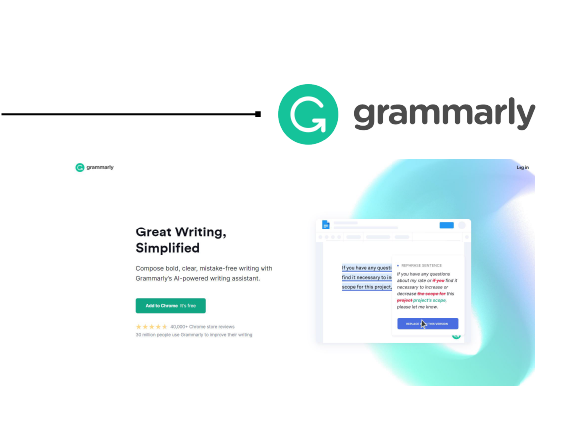
Homepage sends a clear and concrete message about the services this app is offering. Brief description of the services, inviting call-to-action button, and an interesting animation demonstrating the services Grammarly is offering. This is a great and smart addition as many people prefer digesting info in an interactive way.
Trello
In this example, the design is created as a long page, but the focus is on a sign-up form. The homepage is simpler than in the previous example, as Trello doesn’t have any animation. This ultra straightforward page is not cluttered by the usual additions like menu, links, clients testimonials. They are all positioned at the very bottom of the page to avoid any distractions.
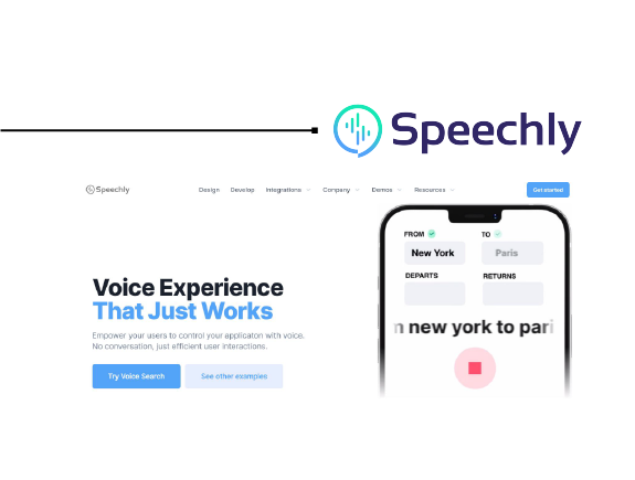
Speechly
Very intuitive, Speechly follows all recommendations of a good design, such as
- Simple, functional design
- Clear navigation
An interesting extension is speech recognition API (speech recognition API).
Dark Mode Website Version is a Popular Trend, Used by Apple, Instagram, Facebook, and Twitter
This trend is in fact very practical but also meets esthetic criteria. These are the benefits:
- It gives a modern look to the website
- Enables more pleasant light contrast when the user is in a low-light-level surrounding, and/or dark. Studies conducted in the USA proved that more than 65% of the grownup population spends a significant time on their mobile devices before a night’s sleep. Apple users can even schedule the automatic switching to a dark mode.
If you’ve been thinking about refreshing your website design, contact us, and book a consultation. In meantime, you can check our portfolio and designs we created for our clients. We truly hope your new design solution will find a place on our Portfolio page, too.
