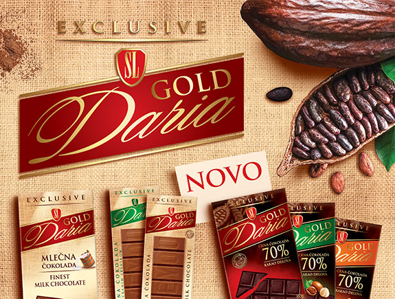
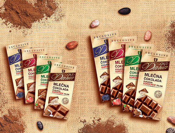
Each time we start creating a concept for a future packaging design for chocolate, we are striving to go back to the very essence of this process and ask ourselves what is and how should the package look like. In our opinion, the chocolate package should practical, functional and appealing, to tell a story and stay in customers’ minds. The image on the package should look perfect.
Preparation and research are the keys to success
Before we start making the first outlines, we always ask ourselves the 3 most important questions:
- What is a product?
- Who buys that product?
- Where and how do the consumers buy this product?
We have decided to make this case study based on Daria Gold chocolate. It’s a unique line of various tastes (starting with classic milk taste, chocolate with hazelnuts, even the unexpected wild berry taste).
Homemade chocolate of a top-notch quality
Let’s introduce our client – Swiss Lion. A well-known confectionery on our market, building a reputation for years with a production of a wide range of sweets. A part of all celebrations, birthdays, or Sunday lunches. We have been collaborating with them for years, designing the packages of many products but this time we will focus on Daria Gold chocolate.
Answers to questions
Let’s start with the first question, which seems to be the most obvious one. What is a product? Different types of chocolates, but… there is more important information. We took care of the material the package should be made of as we didn’t want the chocolate to break during transport.
Next, we took care of the inner package – chocolate foil, which will preserve the freshness of the product and its initial shape, so the imprinted parts stay undamaged.
Now we come to the answer to the question – who buys the product? In our case, this is an ideal product for all female chocolate gourmands who appreciate well-wrapped chocolate and are of the age 20 – 60. In other words, Daria wins equally the young and older population of consumers.
When it comes to the target groups, we don’t want to limit on women only because we are sure that men like chocolate too and give it as a present to their girlfriends especially if their names are – Darija or Daria.
The third question is also very important as it directs us to think about the place for displaying the product, shops to sell it, and finally what is the most frequent place where people will buy it. You can find Swiss Lion chocolate Daria in their exclusive shops called “Sweets home” but also in all other big markets.
For all these reasons we tried to make the luxury and striking design to draw the attention of consumers who are fond of good quality homemade chocolate nicely packed.
Goals and tasks
The goal in creating the look for Daria Gold chocolate was to build an exclusive, lavish package design, that will follow the quality of a product so the consumers can enjoy the attractive-looking package.
To achieve this goal, we split the task internally into several ones.
- Gather all the needed information about the brand – logo, corporate colors, and fonts
This info was significant so we can start the work but also direct the work properly.
Vector logo was the first important info we usually ask from the client, fonts, and colors.
- Gather info on the package look
We asked the client about the most important info that should be placed on the package itself. The answer was the logo, ingredients, and other technical details.
- The creative process can start
We were picking the colors, fonts and decide how to order the elements. We decided to make the background in a neutral creme color, to emphasize the other elements. We used four colors (red, green, brown, and blue) to mark different tastes of chocolate and additionally put an accent on the words “exclusive” written at the very top, highlighting the premium quality.
The soft texture of milk chocolate, inspired us to choose the curved fonts for the product name, and to add a bit of luxury to this package, we used gold for the words Daria and Gold.
And then we put the main element into this visual, and that was the product presentation.
- Photo session in a photo studio
The process of photographing package design for a new product is one of the crucial points, as we want to present the product in a most authentic and better way, pointing out its best strongest attributes. When it comes to chocolate, we knew it is important to show the filling, and how rich it is, so the buyers understand its structure at first sight and wish to try it.
- Sorting elements and fine-tuning
When we finally gathered all the relevant info, chose the colors, dealt with photo shooting, it was about time to pack all that into a visual that will represent the new package of Daria Gold chocolate.
This was our idea…previously, we mentioned we put the exclusivity of the product at the very top, then we add the client’s logo, product name in gold on four different backgrounds, product description in the middle, and the explanation on the type of chocolate, next at the bottom part, we put the retouched product photo. In the left corner, we put the textual explanation on the chocolate filling (strawberry, blueberry, milk chocolate, and hazelnut).
Titan Solution for Daria Gold chocolate
In the end, we just want to show you the final design for Daria Gold chocolate. This was one of our favorite projects, and we are always happy to see it in the markets, as this chocolate definitely dominates.
We are preparing a new case study. Till then, you can share this blog post with someone who will find it valuable. And if you are interested in this topic, don’t miss our previous post, where we wrote about the most important trends for 2020.


