„ Well, I don’t love it. But it will grow on me.”
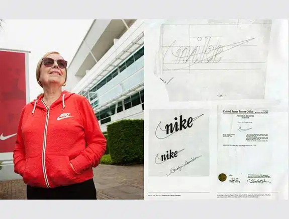
That’s what Phil Knight said when the Nike logo was presented to him.
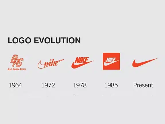
Today, it is estimated that the logo alone is worth 26 billion dollars.
And undoubtedly, it represents one of the greatest symbols ever.
So why didn’t he ask Carolyn Davidson, the designer, to create another logo?
Because the logo is not a reflection of our personal taste, but it conveys a specific message to the target audience.
Nike logo:
- Represents movement and speed
- Describes a line of motion
- Represents wings (Nike, the Greek goddess of victory)
- Represents victory (Nike, the Greek goddess of victory)
- Describes strength, resilience, passion
So, how do you know if you’re on the right track with a good logo?
Test the logo:
- Does it represent your brand story in any way?
- Does it express the core values of your company?
- Does it evoke curiosity in your target audience?
- Does it look different from what your competition is doing?
- Does it look good on all branding mediums?
- Does it have a timeless appeal or will it become outdated with trends?
- Is it simple enough for consumers to draw from memory?
- Does it look great in both large and small formats?
- Does it contain a font that is owned by someone?
- Does it look good in both “black on white” and “white on black” variations?


