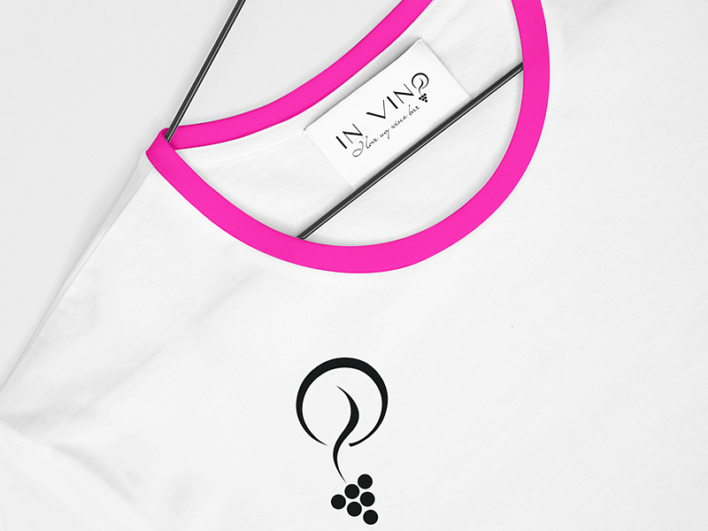
Logo design for a wine bar
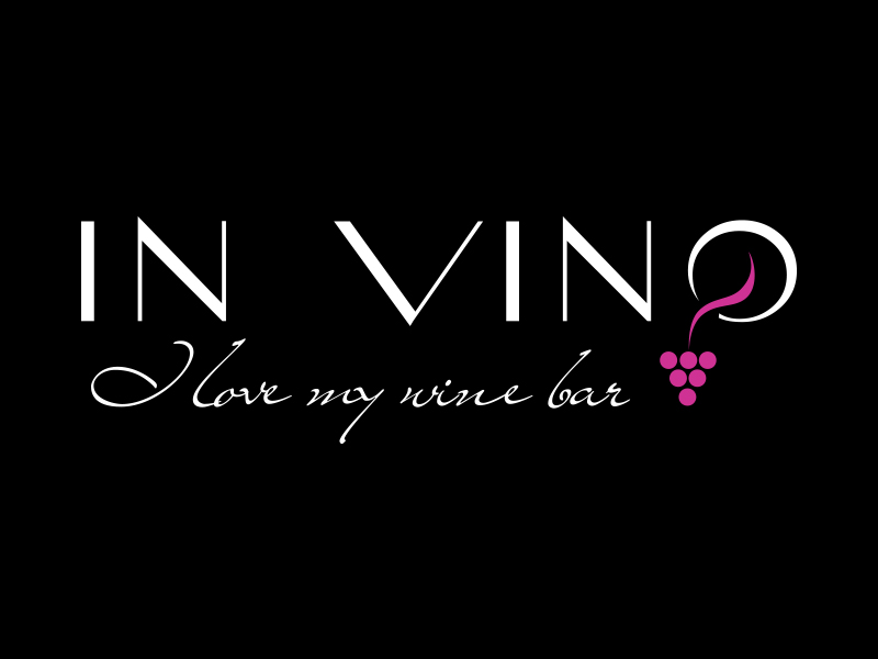
Logo design for a wine bar represents typographic visual solution. The game of the typography and symbols, in this case, clusters embedded in the letter O. Simple solution logos, so that we harness the power of typography in the service of the logo. So in that case, only the name is the logo. The colors are simple contrast between the black, white and purple. In the typography we have achieved contrast alternation of thin and thick lines in the fonts themselves, therefore the achieved effect of elegance and charm, which the guest needs to get away in a wine bar, as well as the wine he drinks. The slogan “ I love my wine bar“ is different typography of the logo, so as not to disturb the harmony and design of the logo, but it is in harmony with the logo . The slogan here has a role to convey the message of the brand. Logo can be used with or without slogans and always in consistent and harmonious relationship.
