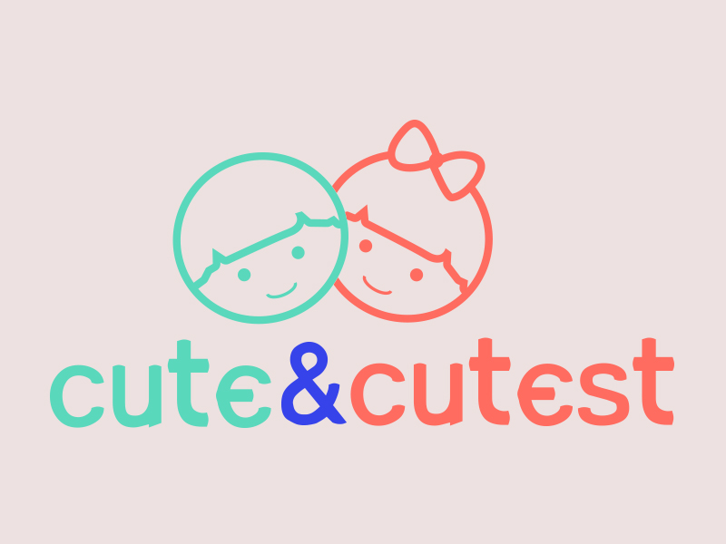
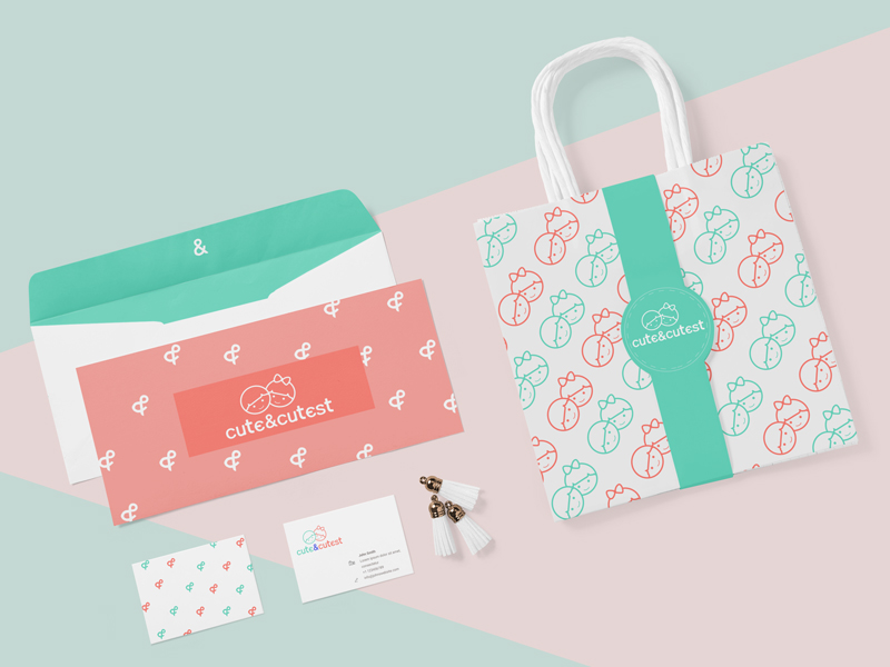
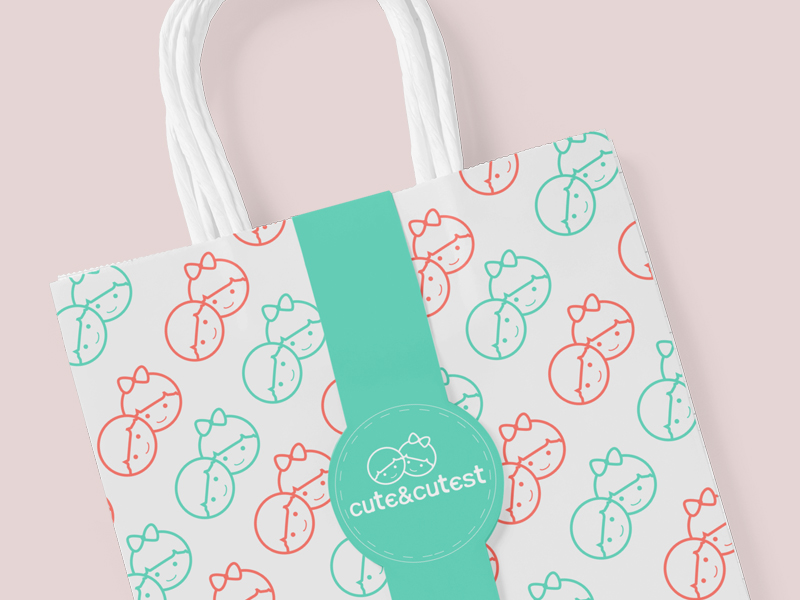
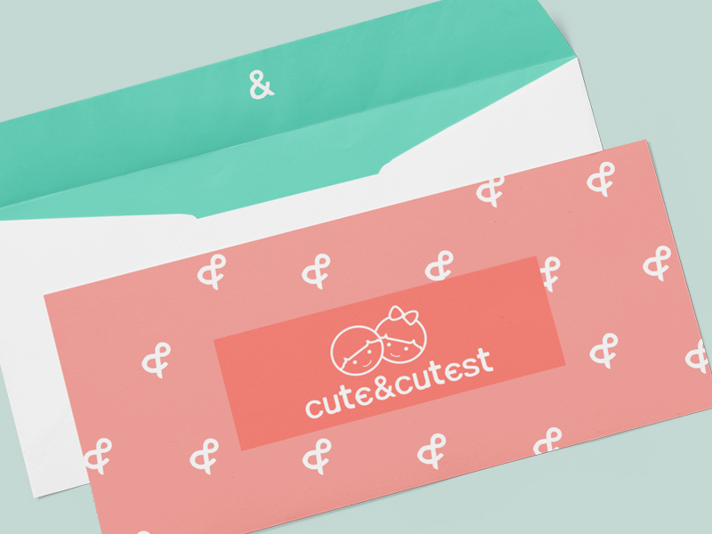
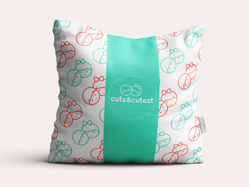
logo design for cute&cutest
Brief Summary We are a new site for mothers to post their baby pictures, and for users to rate who’s the cutest baby on the site.
Brand Name Cute And Cutest
Description: Well.. the site is called “cute and cutest” and it’s for posting baby pictures. So, that should tell you something.
Wants We don’t have much in mind for colors, or a tag line. We’ll be sure to leave comments for all entries though.
Don’t Wants It’s a site for babies and mothers, it should be obvious.
Required file types Layered vectors in EPS & PDF Screen quality JPEG & PNGs
Note: Text in logos should be converted to outlines. Fonts used will be detailed by the designer but are not provided for licensing reasons.
Our work: We were able to design a logo that answered all the requirements of the client. Our idea was that the word cute is blue with the image of the boy above him, a word cutest red with the image of the girl, who had a bruise on his head. We wanted a simple stylized drawing and coloring introduce boys and girls, and to avoid complicated drawing unnecessary details or photos in the logo. Like this logo when reduced to just 2cm, without losing the content and readability. We had to modify font and to deface the individual elements to be unique and tailored to the client’s request. Font follows a linear form and character illustration above. These were filled with all requirements and successfully done work. The best logo design is one that fulfill the requirements of the client, and making it unique in its market.
